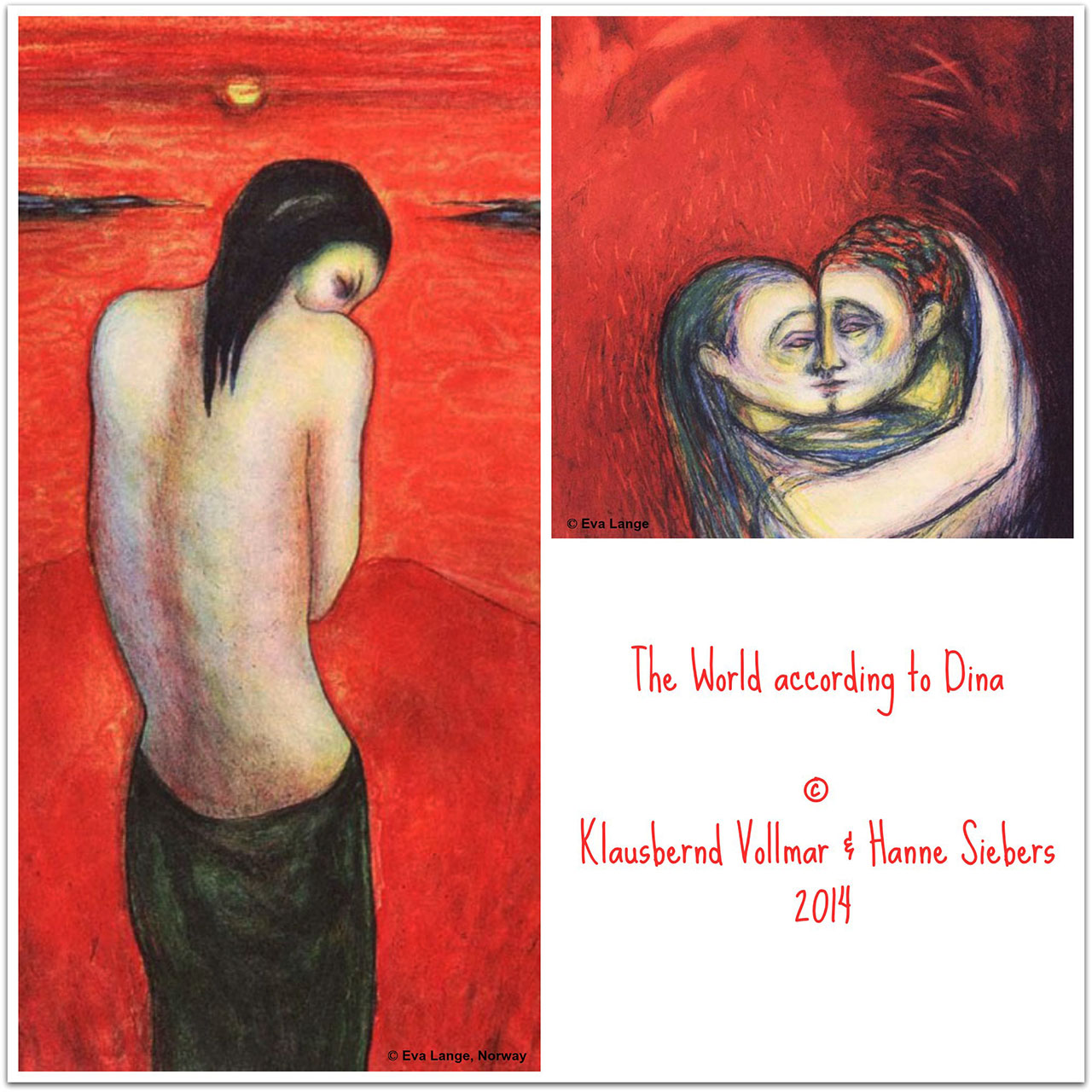
Red as Red can be
I really love red, the favourite colour of all children and Bookfayries! 🙂 It increases the lust for life and I feel more erotic wearing something red. This colour increases my experiences and feelings, I become more passionate and seductive – but, oh dear, if I wouldn’t be taken for a ladybird wearing red all the time.
Selma
Ich liebe Rot, die Lieblingsfarbe aller Kinder und Buchfeen! 🙂 Die Lebensfreude steigt, und ich fühle mich sinnlicher wenn ich Rot trage. Die Farbe stärkt mein bewusstes Erleben und Fühlen; ich werde leidenschaftlicher und verführerischer – wenn man mich nicht nur immer mit einem Marienkäfer verwechseln würde!
Selma
Red is colour of love and hate, sex and danger, elitism and communism.
Red is an attitude to life, an invitation for playing with fire.
Red is the colour of love but it tells us to stop at the traffic lights. What a contradiction! On the one hand it says: “Come!” and on the other it tells you: “Stop!”
Rot ist eine Farbe zwischen Liebe und Hass, Sex und Gefahr, Elitärem und Kommunismus.
Rot ist ein Lebensgefühl, eine Einladung zum Spiel mit dem Feuer.
Rot ist die Farbe der Liebe und jene, die uns an der Ampel gebietet, stehen zu bleiben. Welch ein Widerspruch! Auf der einen Seite fleht Rot: „Komm zu mir!“ auf der anderen Seite sagt es: „Stopp!“
I am taken by red and I use it. If I am weak I need red to provide energy and warmth. It strengthens my will power and my perseverance.
Siri
Die Farbe Rot hat mich, und ich benutze sie. Wenn ich geschwächt bin, mehr Energie und Wärme brauche greife ich zu Rot. Es stärkt meinen Willen und meine Durchhaltekraft.
Siri
Red is an exiting colour which shows something of importance and we all know the frightning red pencil. With red the starts and ends the day. Goethe explains colour in nature with the red sky in morning and evening, both mark the border to darkness which kills all spectral colours.
Rot ist eine aufregende Farbe, die anzeigt, dass etwas wichtig ist, und wir alle kennen den gefürchteten Rotstift. Mit dieser Farbe beginnt und endet der Tag. Abendrot und Morgenrot, mit denen Goethe in seiner Farbenlehre Rot als Naturphänomen erklärt, stehen beide an der Grenze zur Dunkelheit. Nach der dunklen Nacht, die alle Farben auslöscht, kündigt sich das Licht mit Rot an. Am Übergang des Tages zum Dunkel der Nacht steht abermals Rot.
Men seem to have problems with red. Women hardly show any colour blindness concerning red and green (0.7% only).
Different cultures show different attitudes towards red. In Germanic languages f.e. we find few words for different shades of red. People of the South Pacific have many words for the different red shades.
Es scheint etwas Männliches zu sein, mit Rot auf dem Kriegsfuß zu stehen. Die Rot-Grün-Blindheit als häufigste Farbenblindheit kommt bei Frauen selten vor (0,7%).
Die Einstellung zur Farbe und speziell zu Rot unterscheidet sich auch in verschiedenen Kulturen. Germanische Sprachen weisen z.B. wenige Vokabeln zum Unterscheiden der Rottöne auf. Im Vergleich dazu gibt es im Südpazifik eine Fülle von Wörtern für Rottöne.
Red is a problematic colour for me. I hardly wear red clothes and I have never had a red car. It’s too flamboyant, too extreme for me. A woman can wear red but not a man! As an agitated person red frightens me. Red makes me nervous, but one could say as well that red brings life into the grey of everyday routines.
Red irritates me although it was often seen as the archetypal beautiful colour and a colour used in colour healing to dissolve sexual blockages.
Für mich ist Rot eine schwierige Farbe. Ich besitze fast keine rote Kleidung und habe nie ein rotes Auto gefahren. Zu auffällig, zu extrem, meine ich. Rot kann eine Frau tragen, aber doch kein Mann! Als unruhiger Geist werde ich von Rot abgeschreckt. Rot macht mich noch unruhiger und aufgeregter – man könnte allerdings auch sagen, Rot bringt Leben in den grauen Alltag.
Mich stört Rot, obwohl es als die archetypisch schöne Farbe gilt und Farbheiler mit seiner Hilfe sexuelle Blockaden auflösen.
In my love-and-hate relationship concerning red I started to learn more about this colour. When I was a student I took part in experiments about the effect colours have. Do have colours an arousal potential was the question. We gave our probants sophisticated texts to read printed on red, green and white paper. The result showed that this text was hardest to understand if printed on a red background. That was easy to explain: red excites our nervous system that much and draws so much energies that there are hardly energies left for understanding.
Red influences our soul like red flowers do for the instincts of insects.
In einer Art Hassliebe begann ich mich mit Rot zu beschäftigen. Als Student besuchte ich ein Seminar, in dem Experimente zur Wirkung der Farben durchgeführt wurden. Können Farben erregen, wie es der Volksmund behauptet, sollte untersucht werden. Wir unterlegten schwierige Texte mit roter, grüner und weißer Farbe. Es zeigte sich, dass ein auf Rot gedruckter Text schwerer zu erfassen ist, als wenn der gleiche Text vor anderen Farben erscheint.
Die Erklärung liegt auf der Hand: Rot erregt so sehr das menschliche Nervensystem und zieht derart alle psychischen Energien auf sich, dass zu wenig freie Energie übrig bleibt, um den Inhalt des Textes zu erfassen. So kann die wissenschaftliche Psychologie wie so oft bestätigen, was bereits alle wissen: Rot regt an.
Rot wirkt bis in die Seele wie die rote Blüte auf den Instinkt des Insekts.
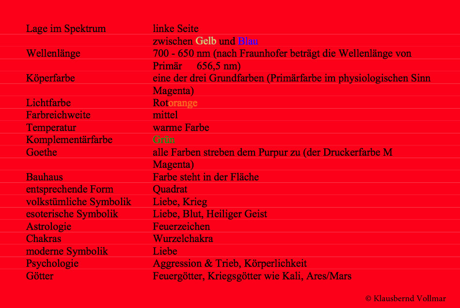
ROT
Goethe makes the point in his “Theory of Colours” that all colours culminate in red and therefore red activates, gives warmth and increases enthusiasm, and this more so as more its shade equals scarlet. Well, I not to mention red lingerie and the red light districts …
Als Höhepunkt der Farben (Goethe) wirkt Rot anregend, erwärmend und belebend. Es wirkt je erregender, desto näher sein Farbton dem Scharlachrot angenähert ist – und über rote Dessous und die roten Laternen von St. Pauli will ich gar nicht erst schreiben.
Red stimulates the life energy but there exists a connection of red and death as well. Artemidor of Daldis, author of the most read book about dreams before Freud, connects red with death and evil by writing dreams of evil persons as well as dreams concerning death in red.
Sprach ich eben vom belebenden bis erregenden Rot, so gibt es auch die Verbindung von Rot und Tod: Artemidor von Daldis, der eines der meistgelesenen Traumbücher vor Sigmund Freud schrieb, verbindet in seinen Traumdeutungen Rot mit dem Tod und dem Bösen. Träume böser Menschen und diejenigen mit fatalen Voraussagen wurden in seinen Texten rot geschrieben.
Before I bore you and will end up in the red hell I will finish now. Many thanks to Dina for the great illustrations and to my beloved Bookfayries Siri and Selma – great fans of red! – for their help with research.
If one says ‘Red’ – the name of color – and there are fifty people listening, it can be expected that there will be fifty reds in their minds. And one can be sure that all these reds will be very different.”
Josef Albers
Um nun nicht den roten Faden zu verlieren und so in des roten Teufels Küche zu kommen, mache ich jetzt Schluss. Ich bedanke mich bei Dina für die feinen Illustrationen und bei meinen so liebklugen wie emsigen Buchfeen Siri und Selma, den beiden Rot-Fans, für ihre Hilfe. Sie machten mich übrigens darauf auf aufmerksam, dass Autor rückwärtsgelesen, mit rot beginnt 😉
All the best
Mit herzlichen Grüßen
Klausbernd
The following books of mine about the colours are not available in English – but (especially for Francesca & Stefano) in Italian: Colori (edizioni red, Novarra 9th ed., 2003)
Bücher von Klausbernd Vollmar zu diesem Thema:
- Das große Buch der Farben (Königsfurt-Urania Vlg.)
- Die Magie der Farben (Königsfurt-Urania, vergr.)
- Das Geheimnis der Farbe Rot (Ed. Tramontane, vergr.)
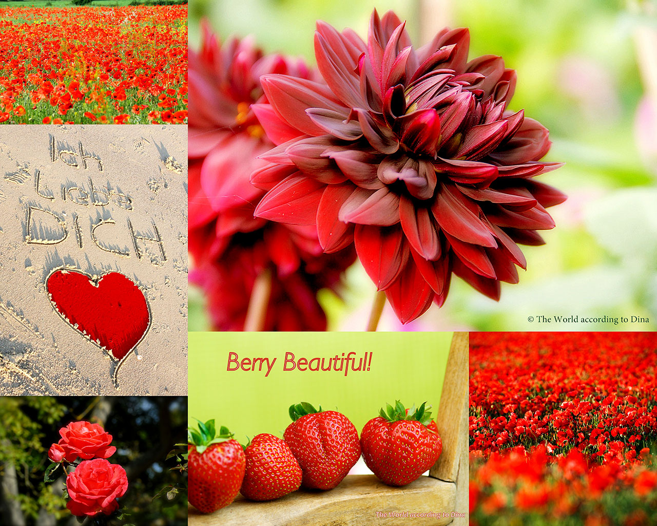
© Red sketches in Collage 1. Eva Lange, Norway © Text and photos Klausbernd Vollmar and Hanne Siebers, 2014

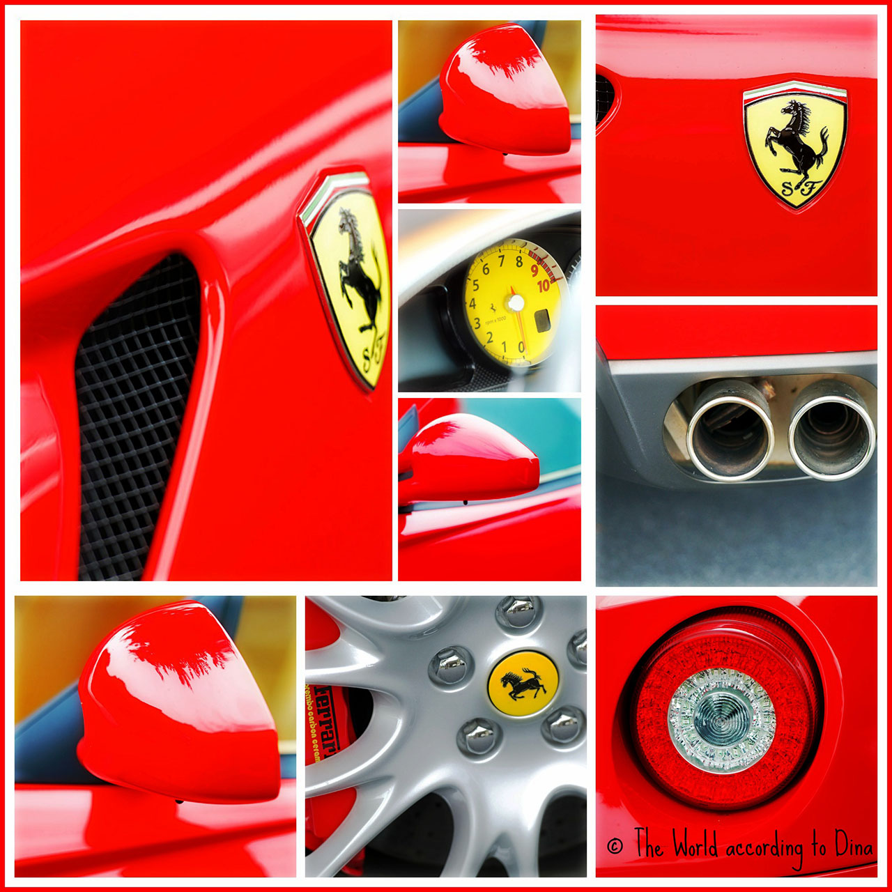
Great idea for a though-provoking post this time, and beautifully illustrated by Dina’s wonderful photos too. The red colour of the Ferrari is really sumptuous, and I have a very old monitor! I would only disagree about red being the sexiest colour for ladies. For me, it is always black!
Love and best wishes to you all from Beetley, Pete and Ollie. x
LikeLike
Good morning, dear Pete,
what a windy but sunny morning.
For me black is the most erotic colour as well, but it depends on the type. Imagine a red haired woman with green eyes in a tight red dress … well …
The Ferrari-red and the Coca-Cola-red, being the red of father Christmas as well, are very impressive. Every prime colour has it’s very impressive shade. Blue, we write about later, has this Ives-Klein-Blue (IKB) and yellow has this special yellow of the post (on the continent).
But back to erotic: Black and red was always seen as the most erotic colour combination. Not very subtle, I admid, btr it seems to work because survey results show that for the majority of people in the western world this colour combination has the highest erotic power.
Have a happy weekend 🙂
All the best to you and Ollie
Klausbernd xx and the rest of our gang 🙂
LikeLike
Thanks you so much for your kind words, Pete!
Lots of love to three of you in Beetley from Bonn,
Dina
Is Beetley colorful you think or rather Norfolkish? Bonn is very pretty, with lots of fine colours. I love the typical Norfolk colours, the greens on the windowframes etc
LikeLike
No Dina, Beetley is not so colourful. Most of the houses are modern, and there are lots of farms around, so the main colours are just greens and browns. You have to go to Suffolk, to see the old houses painted in pinks, light blues, and yellows, to get that colourful feel.
Best wishes as always, Pete. x
LikeLike
Ich liebe ja schwarz! Herzlichen Glückwunsch zum roten Spielmobil, die gibt es auch in gelb!
LikeLike
Ich bin ja auch eher ein Schwarz-Fan, aber Rot hat ohne Frage auch seine umwerfende 😉 Wirkung.
Du benutzt ja in deinem Gravatar eine Orangerot, das fällt doch sogleich auf.
Und noch etwas: Ferrari in Gelb finde ich “voll daneben”, wie Siri Buchfee es ausdrückt.
Herzliche Grüße von der heute windigen Küste Norfolks
Klausbernd und seine liebe Buchfee Siri
LikeLike
Herzlichen Glückwunsch??? 🙂 🙂
LikeLike
I love red too! Well, I love all colors really! My watercolors are always bright colorful. It’s the one unifying element in all my paintings, People always tell me the can recognize my paintings because of my color choices, no matter what the subject matter is. Color tells a story and sets the mood. Like this painting of pomegranates where red is the star of the show:
LikeLike
Dear Estramer,
thanks for commenting 🙂
Colour tells a story, I agree very much, and every colour has a certain personaliy with specific gestures and a history. For a long time red was the grand colour only hightest nobility was allowed to wear (from classic Roman times onwards) because it was the most expensive colour to produce. F.e. it was a great demonstration of power when Cleopatra sailed under red sails or when one Medici woman got married in a bright red dress. Red quite often is the star of the show, indeed!
All the best
Klausbernd and his busy Bookfayrie Siri
LikeLike
Toller Beitrag, die Farbe scheint dich ja richtig zu beschäftigen. Ich finde Rot wirkt nur, wenn man eine Kontrastfarbe daneben stellt, typischerweise Schwarz, aber auch Blau und Gelb machen sich gut. Die Trikotfarben grosser Fussballmannschaften sind rot-blau (z.B. Barcelona, Bayern München). Wirst du auch noch über andere Farben philosophieren? Viele Grüsse Thomas
LikeLike
Guten Morgen, lieber Thomas,
ich gebe dir völlig recht, speziell Schwarz oder Blau lassen Rot erst richtig seine Stärke entfalten, was einige Maler wie Nolde nutzten und ihren roten Bildern einen schwarzen Rahmen gaben.
Ja, ich werde auch noch über Gelb und Blau bloggen. Ich habe im Bereich der Symbolik und Wahrnehmungspsychologie länger über Farben geforscht und mehrere Bücher über die Wirkung der Farben geschrieben. Da konnte ich richtig meine kindliche Liebe zu Buntstiften ausleben.
Es gibt Forschungen über die Wirkung von Farbe im Sport. Wenn Rot im Trikot auftritt, wird die entsprechende Person als aggressiver eingeschätzt, so geht’s auch mit Autos. Fahrer roter Autos werden unabhängig vom Fahrstil als aggressiver eingeschätzt. Das mag auch einer der Gründe sein, warum, laut Versicherungsstatistik, rote Autos überdurchschnittlich häufig in Unfälle verwickelt werden. Es ist ja nicht nur eine Einschätzung, sondern Rot macht auch aggressiver.
Ein angenehmes Wochenende wünschen dir
Klausbernd und seine liebe Buchfee Siri
LikeLike
Ein schöner, farbenfroher Beitrag! Ich liebe rote Blumen, wenn nur der Garten größer wäre, ich hätte viele davon! 🙂 Habt ihr viele rote Pflanzen und Blumen in Cley?
Warum trägt der Papst rote Schuhe, was ist die Symbolik dahinter?
Liebe Grüße überm Kanal
Ursel
LikeLike
Guten Tag, liebe Ursel,
danke dir, für deinen Kommentar.
Ja, wir haben soooo viele rote Blumen hier in Cley und Umgebung, dass unser Gebiet auch nach einem Roman von Clement Scott “Poppyland” genannt wird. Mohn wächst hier in rauen Mengen und es wird auch Schlafmohn angebaut, so dass man bisweilen an knallroten Feldern vorbeifährt. Bei mir im Garten wie auch bei all meinen Nachbarn ist Mohn ein Unkraut, das wir ständig bekämpfen müssen.
Warum trägt der Papst rote Schuhe? Rot ist in der römisch-katholischen Kirche die Symbolfarbe der Märtyrer und ich nehme, das der Papst damit ausdrückt, auf der Grundlage der Märtyrer zu stehen. Dazu kommt noch der machtpolitische Aspekt, der für die katholische Kirche wahrscheinlich der wichtigste ist: Rot war die Farbe der Kaiser und des höchsten Adels (da sie die teuerste Farbe für lange Zeit war) und der Papst stellt sich damit den höchsten weltlichen Würdenträgern gleich.
Liebe Grüße nach Frankfurt von den
Fab Four 🙂 xxx
Klausbernd
LikeLike
I’m a red fan myself. Love the colors!
LikeLike
Dear Elena,
I don’t know if you are red haired, but your gravatar shows a woman with red hair. And, of course, nearly everybody with red hair loves red. And red suits a red haired person usually very well.
Thanks for commenting
the Fab Four
Kb 🙂
LikeLike
Ferrari red is my favorite red of all.
LikeLike
Dear John,
it’s one of the most powerful colours, the colour with the biggest arousal potential.
Thanks for commenting
Klausbernd 🙂 and the other 3
LikeLike
Mine too, John. I love the warm red, with the touch of yellow. As you can see from my photos as well. 🙂 The cold red with a hint of blue is not for me.
Happy weekend!
Dina
LikeLike
Wunderbar – die verschiedenen Gedanken über das Rot – und die Blicke darauf.
Viele Grüße, Claudia
LikeLike
Danke, liebe Claudia,
bei “das graue Sofa” fällt mir ein, dass ich die Verbindung Grau mit Rot edel finde.
Liebe Grüße und ein feines Wochenende
Klausbernd und Dina, Siri und Selma
LikeLike
Red strawberries – berry beautiful indeed! – certainly makes me happy and not nervous! 😉 on a warm summer evening. I love bright red, sweet strawberries with champagne, it’s quite a sensual combination.
Sometimes I find red (and black) a bit over the top when presented by all the love-to-be top models, displayed with modesty I think red is great, especially on a rainy day.
I wonder if I should get a nice set of red underwear, if the energy will do me any good? Even thought of it seem to cheer me up! 🙂
Have a great weekend, all fabulous four!
Kram, Annalena
LikeLike
My dear friend Annalena,
have a look: http://kbvollmarblog.wordpress.com/2012/07/15/erdbeeren-die-rote-verfuhrung/
There I blogged about the red seduction of strawberries (in German, but you understand enough German to get it). I love strawberries and grow them in my garden. But it’s quite a job in such a dry area because they need lots of water. But I am happily willing to do it to fullfill my desire. And as we touch the topic of desire: wearing a red set underwear gives you immediately female power. It makes you feel erotic, just try it out. And it will cheer you up anyhow.
Have a great weekend too.
Kram xxx
The Fab Four
Kb 🙂
LikeLike
Somehow, until I read your post, I never thought of two sides of the red – now, I have more o think about : )
LikeLike
Every prime and secondary colour has a polarity – a positive and a negative side …
You remind me that I should have written about red wine and the different reds there, but unfortunately I don’t know much about wines. Maybe you can say something about red as in wine?
Thanks for commenting
Klausbernd
LikeLike
I can’t find any polarization in the red wines – there is only a limited amount of information the actual color reveals about wine…
LikeLike
Thanks for answering, I didn’t know that.
Kb 🙂
LikeLike
Ja, schade, dass wir nicht daran gedacht haben!: Niemand kennt wohl so viele Varianten des Rots wie der Degustator, sein Wortschatz ist beinahe unerschöpflich wenn er von rot spricht: rötlich, hellrot, ziegelrot, karmin, kirschrot, blutrot, granat- und rubinrot, feuerrot, purpur, violett, ocker, blau, kaffeebraun und schwarz und meint damit „nichts anderes als Rotwein.
LikeLike
I love ferrari! I’m Italian!!!!!!!!!!!!!
LikeLiked by 1 person
Great!
Have a happy weekend
🙂 🙂 🙂 🙂
LikeLike
❤️ to beautiful Italy! ❤️
LikeLike
Thanks to much! greetings and kiss Rom Italy!!!!
LikeLike
Thanks to much! greetings and kiss from Italy!!!!!!!!!!!!!!!
LikeLike
👍😄❤️💋
LikeLike
🙂 xx
LikeLike
What a wonderful thought provoking post. Again. I adore the red Ferrari – I once lived in a flat and in a garage behind me were several Ferraris – I only wish one had been mine. But I have driven a red car (what they call a ‘boy racer’ belonging to my son). For some reason men at traffic lights always wanted to race me (and I usually won 🙂 )
As a red-head wearing red was not something I did until my forties when I realised that actually it suited my complexion, but like Pete from Beetley, I think black is sexier.
And don’t forget painting a wall red to add passion and warmth to a cold room, though you need to be careful not to make it look as though you are living inside a tomato. I tend to go for the blue-red tones as an accent colour, not the scarlet you have shown.
As usual kudos to Dina, Siri and Selma for helping you put together a great post KB, and have a fab weekend all 🙂
Jude xx
LikeLike
Dear Jude,
a Ferrari wouldn’t be my choice of car, too impractical and not really comfy – and this image, oh dear … If a person of my age drives a Ferrari everyone will see this as a sublimation. “Potency problems” is the first association of most of the women and quite some of the men as well.
I drive a black Volvo (but sport-version) which suits me …
A dark red as wall colour immediately makes a room feel warmer but it has to be a big room otherwise you will get claustophobic in it. I love your expression “be careful not to make it look as though you are living inside a tomato” – it’s Great! A brownish red I like as a wall colour.
Thank you very much for your kind commentary.
A great weekend wishing you
the Fab four
Kb 🙂
LikeLike
Lovely comment, thanks a lot, Jude!
Well, I’m a friend of tomato red, the yellow-red, the blue-red tones are too cold for my complexion. I suppose that’s why I favor the warm red tones in my surroundings, I was not quite aware of this until now. 🙂
Enjoy your weekend!
Dina xo
LikeLike
Red is definitely a vibrant colour, I love it and it always cheers me up.
LikeLike
Dear Joan,
you really look cheeful in red on your gravatar – indeed!
Thanks for commenting
the Fab Four wishing you a happy weekend
Kb 🙂
LikeLike
Hej ni allihopa!
Vor mir steht ein Glas franz. Rotwein. Heute roch ich am roten, superexclusiven Lippenstift den ich mir vor 10 Jahren zum Abschied in Deutschland kaufte. Ich habe es nicht bereut. Die richtige Farbe, noch nicht ranzig und megastark. Schwarz und rot, ab einem gewissen Alter die totale Provokation. Vom passenden Seidenschal dazu werde ich mich auch nicht trennen. Wer weiss was kommt. in diesem Sinne kram Ruth
LikeLike
Hej, liebe Ruth,
ja, auf Wein und das Cochinillenrot von Campari und Lippenstift bin ich hier nicht eingangen. Ich kann mir vorstellen, dass es nicht einfach ist, die richtige Farbe für seinen Lippenstift herauszusuchen.
Schwarz und Rot finde ich wie viele einfach geil 😉 Aber man kann’s ja abschwächen, wenn man sich schwarz kleidet und kleine rote Accessoires dazu trägt, wie z.B. der rote Seidenschal – und ich muss zugeben, dass ich auch einen roten Seidenschal besitze, den ich gerne mit grauer Kleidung kombiniere.
Ganz liebe Grüße dir nach Schweden 🙂
Kram xxx
Klausbernd und die anderen Drei
LikeLike
Beautiful post, Dina. I happen to have a glaring gap in my personal wardrobe: not a single piece of clothing in red. Somehow I never thought it was for me. Even on my blog, Colltales, red is used sparingly. Your post made me think, why not? Best
LikeLike
Thanks for your commentary.
Well, red is always most effective if used sparingly – I think.
And as I wrote, I have hardly any red piece of clothing. Is not the ideal colour for men – but only nowadays, in former times men liked wearing red.
All the best
Klausbernd 🙂
LikeLike
Agreeing with “colltales”…..beautiful post!
Here’s to all the colours in the red rainbow….
Best wishes….R.
LikeLike
Thanks for your kind comment 🙂
Have a happy weekend
the Fab Four
Kb
LikeLike
Some great thoughts on red! And I’ve been wearing red today…. And have owned red cars. Oh dear, what does that say about me? Happy weekend! 🙂
LikeLike
Dear Sue,
what people will project on you? Outgoing, powerful person. But what it says about you is another question. We usually choose red when we want to be noticed and when we need to show power meaning that we feel weak – consciously or rather unconsciously.
Have a happy weekend too 🙂
The Fab Four
Kb 🙂
LikeLike
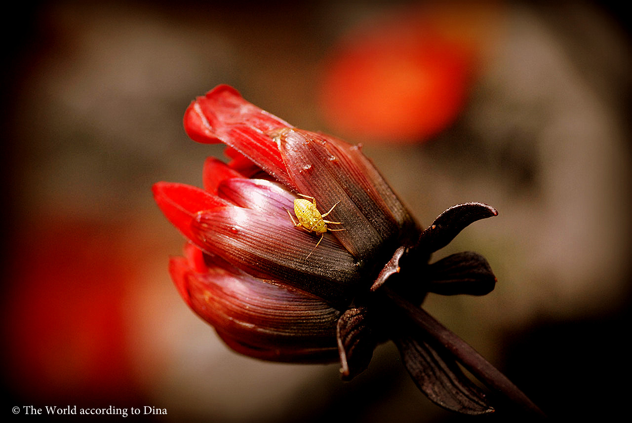
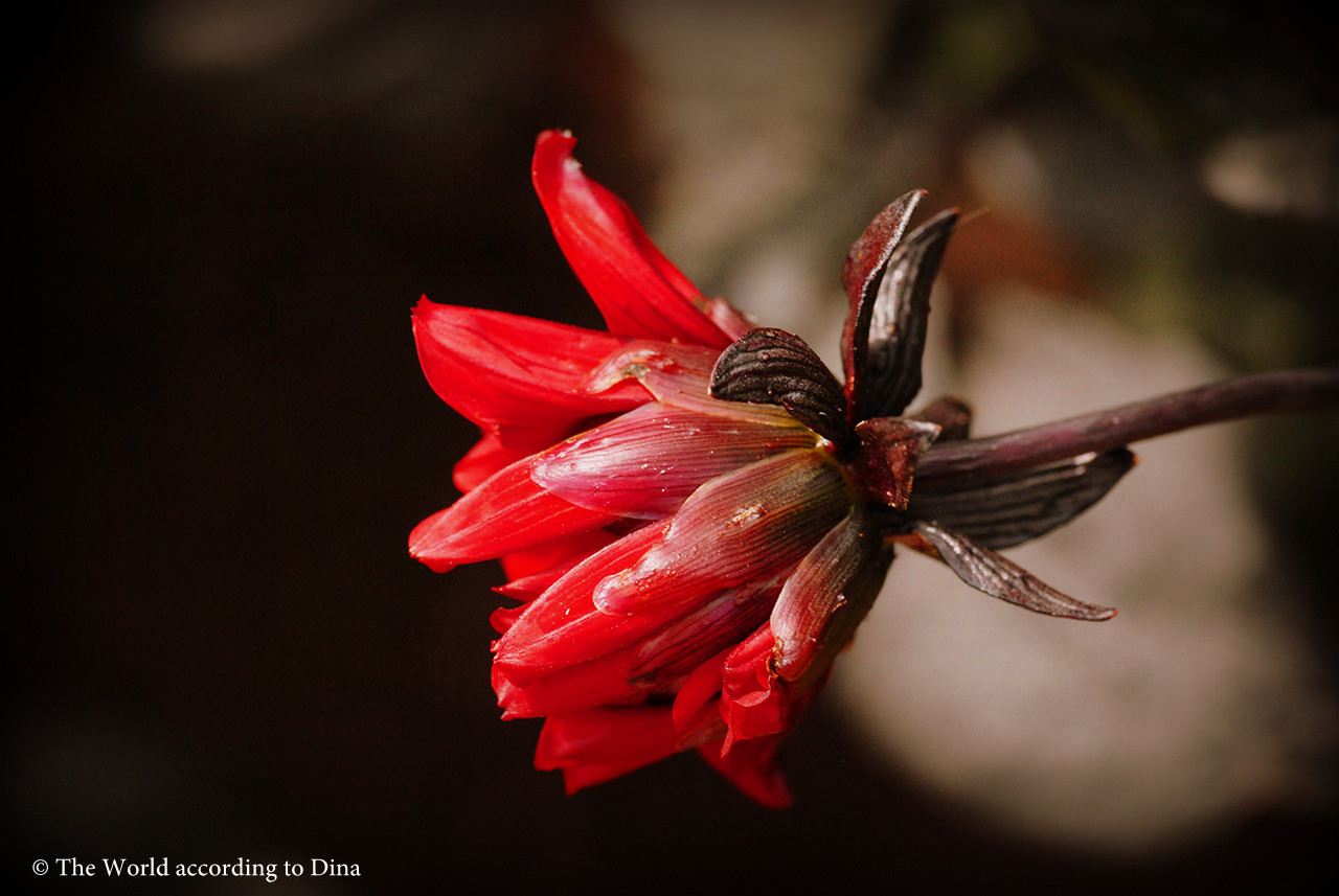
Lovely, wonderful reds. What’s the name of the red flowers? I’ve never seen anything like them. Not meaning the poppies – are they from Poppyland Norfolk? 🙂
Greetings from Ely,
Elizabeth
LikeLike
Dear Elizabeth,
oh dear, you got me, I don’t know the name of this red flower too. Maybe Dina knows it – or our Bookfayries Siri and Selma have to consult their friends the flower fairies.
Thank you for reacting to our post 🙂
With warm greetings from Poppyland to Ely
Klausbernd 🙂
LikeLike
Dear Elizabeth,
yes, the poppies are from Norfolk, not exactly the Poppylandstretch between Cromer and Sheringham though. Last year we went to see Sissinghurst and on our way back, just after we had left Suffolk on our way to see Oxburgh Hall, we made a rest in the near of a magnificent poppy field. I have never seen anything like it! 🙂
As for the other flowers, they are very special indeed, thank you for noticing! As a matter of fact, I think it should be mentioned in the article what and where the images are taken, we’ll do so in the future. Anyway, they are dahlias! 🙂 I took the photos at one of my favorite National Trust properties in Cambridgeshire; Anglesey Abbey. The dahlias show in autumn is very impressive, colorful and well worth a visit. So ist the beautiful Jacobean-style house too!
I love Ely! I used to live in the near and a friend of mine lives in Haddenham, we often meet in Ely. The Saturday market is great. 🙂
Have a great weekend!
Dina
LikeLike
A wonderful tribute to my favourite colour 🙂
LikeLike
Thank you 🙂 dear Jo
A fine weekend
the happy Gerwegian English family 😉
Kb
LikeLike
Gerwegian English family – who on earth an came up with a name and nationality like this! 🙂 Gerwegian sounds special and interesting, you should put a copyright on it. 🙂 We have so many Gerwegian sayings already, it almost like Denglish., don’t you think? How can we integrate English into Gerwegian?
LikeLike
Red is indeed a very strong, provocative color. Did you know that red is also the color of the root chakra (there are 7 major chakras – energy centers in the body). The root chakra is about our sense of security and worthiness, whether we meet others with trust or mistrust, based on our primary relationships in childhood. Anodea Judith has written quite a bit about the links between Western psychological concepts and the Eastern understanding of chakras.
LikeLike
Yes, thank you very much.
I mentioned the connection of red and Muladhara in the chart about red (in German only) in this post. But not in Yoga philosophy only red and grounding is connected you find this already in Plato’s ideas that red, the square and grounding are closely associated.
When I was working at American universities I did a lot of bioenergetics and my teacher B. Lee Rosenberg saw a close connection of Yoga and psychological concepts of the west as well. But thanks for mentioning Anodea Judith, I will have a look.
I wrote several books about the chakras too. “Journey Through the Chakras” is the one which is translated into your language and in which I drew the connection between psychoanalysis and Yoga philosophy. And not to forget A. Watts and his classic “Psychotherapy East West”.
All the best and thanks a lot for mentioning the Yoga philosophy
Klausbernd 🙂
LikeLike
I like wearing red on days when I feel extroverted and optimistic, courageous and confident. It’s not the colour I choose when I’m feeling blue. But maybe I should? 🙂
Klem til dere alle
Hjerter
LikeLike
Hi, dear Hjerter,
well, you should at least try it the other way round: choosing red when you are feeling blue. I suppose it would help.
Lots of love
Klem xxx
the Fab four
Kb 🙂
LikeLike
Dette ble et skikkelig innlegg med trøkk!
Utrolige røde nyanser både i farger, motivvalg og i tekst!
LikeLike
Hei Hans,
takk for din kommentar! Din rødorange våtdress lyser opp i blogglandskapet. Du har valgt et flott bilde for din gravatar, synes vi. Skikkelig tøfft! 🙂
Ha en riktig god helg. Så synd at Birkebeinerløpet ble avlyst da.
Mange hilsener fra oss fire
DIna
LikeLike
Ja, all treninga er helt bortkastet…
LikeLike
I want to us the colour red for my coming website and blog for my business (food/health/activity). I have a few ideas, but which colour complements and balances red the best? How can I strike up a little red and make the most of it? I have studied lots and lost of blogs and websites, red is an eyecatcher and very effective if used rightly, but I obviously have to be careful that it’s not too domineering.
Thanks a have great weekend!
Rachel
LikeLike
Dear Rachel,
first of all you have to see with the colours of your advertisement you choose the clients you want to get. At least for me red has a tendency to undecency. I wouldn’t use red in advertising because I went for more sophisticated clients. And there occurs another problem with red as a colour for a website: red is a background colour on which writing is hard to read. So I would rather go for an light shade of orange and combine this with a light green. But if you would go for “the masses” then red is okay but even so, as you wrote already, you have to be carefull not to use too much red.
Colour is a language which says as much about your business as words. And I don’t know if red is communicating what the philosophy of your business is. If you go for an unbroken red you surely go for the more unsophisticated and young clients which is fine if you go for big sales. But then you compete with big companies. If you go for a specific group of clients then red is too mainstream, too much used for advertising cheap products.
Usually green as the colour of harmony is used to advertise health products, even McDonald is using green 😉
Well, I hope that my answer will be of any help.
Good luck
Klausbernd 🙂
LikeLike
Gotta love Red!
My wife has an old classic red Miata.
LikeLike
Dear Phil,
oh dear, I just had to look up what a Miata is and noticed that in all the pictures of this car it’s always red.
Didn’t Cartier-Bresson once said every picture needs red in it?
Thanks for your commentary 🙂
Klausbernd and his helping Bookfayrie Siri
LikeLike
Dina – your photos were profoundly moving. I love red – ever since I was a child, I owned this colour because it held a bold promise of joy and excitement – and a delightful unpredictability. I was a red-head (still am, with a little help, of course) just as my father and his mother before me. You can imagine my agitation when everyone told me that red-heads could not wear red. I was advised that ‘green’ was my colour. As a nine-year-old, I didn’t want to look like I was a Christmas ornament.
Siri & Selma – you continue to amaze me with your insight and candor!
KB – I would love to have been in your classroom! You always give me something to think about in the days ahead.
Hugs to the Fab Four!!! Have a wonderful weekend….
LikeLike
Dear Rebecca,
I just see it the other way round: red is the perfect colour for red heads. It usually suits them perfectly well. But, of course, there is quite a strong puritanic reservation against red. Too much joy …
And thanks, my dear friend, for your compliment. I liked teaching at the universities but I prefered writing. Although in my life as an author I had to give lectures all the time and I always loved the the end part most, the discussion and question periode.
By the way it took me many, many years to like green. I have been a very fair haired type for quite a while and certain cold greens I like now. In an unbroken green I look like a Christmas tree – same associations as you had.
Thanks for your kind commentary again and lots of love to Vancouver from the Norfolk coast
Klausbernd and the rest of my Gerwegian English family 😉
LikeLike
DELIGHTFULLY different! I just LOVE posts that are utterly individual and have nothing whatsoever to do with any ‘challenge’! Extremely interesting because of being well researched. Yours really is a top-class blogsite, you lot! 🙂
LikeLike
Dear M.R.,
wow, thank you sooooo much 🙂 We feel flattered 😉 Great!
Have a marvellous weekend
the Fab Four
Kb
LikeLike
Thank you so much, dear M.R! You made our day! 😄
Happy greetings from Siri & Selma
👋 👋 👭
Sending you lots of fayriedust 💫✨🌟💫✨🌟💫✨
LikeLike
Guten Morgen, Hanne und Klausbernd und natürlich auch ihr kleinen Feen,
ich bin ja auch so ein rot-Fan. Eine Zeit lang habe ich nur mit rot gemalt – mehr unbewusst. Ich musste das Rot erst in den Schrank verbergen, um die Rafinesse der anderen Farben zu nutzen.
Ich finde Rot nicht auffällig, es ist leuchtend – ja – aber gelb ist meines erachtens noch viel auffälliger…ich weiss, es steht für neid etc. …
Aber jeder ist ein Farbtyp und ich glaube auch, kb, dass du nicht der Rot-Typ bist.
Ich zeichne zur Zeit mit bordeauxfarbender Tusche meine Grimma Leinwand, es ist ein schöner Kontrast zum Weiß der Leinwand.
Einen schönen Samstag wünscht euch Susanne
LikeLike
Guten Tag, liebe Susanne,
ja, da hast du wohl recht, ich bin nicht der Rot-Typ. Ich bin ein Fan der Grautöne und des Spektrums zwischen Blau und Grün. Die Farben stehen mir auch besser. Obwohl ich ein rotes schickes T-Shirt besitze, das mir gut steht, aber das ist ein kaltes Rot. Mit einem Rot, das zum Braun hin tendiert, kann ich mich auch anfreunden.
Wie ich bereits auf Rebeccas Kommentar antwortete, natürlich haben Rothaarige eine besondere Beziehung zu Rot, schon alleine, da es ihnen fast immer gut steht. Außerdem können sie sich sehr gut mit Rot identifizieren.
Wafür ein Farbtyp bin ich denn in deinen Augen?
Ganz liebe Grüße und ein Wochenende vom Feinsten wünscht dir
Klausbernd 🙂
und die anderen 3 rufen: “Liebe Grüße, tolles Wochende!”
Siri: Weißt du übrigens, dass rothaarig zu sein, etwas ganz Besonderes ist. Irgendwo las ich, dass in paar Generationen die Rothaarigen ausgestorben sind.
LikeLike
I love the colour red too! It signifies risk and attention for me, but warmth too. I was interested to read that Germanic languages have fewer words for red… when I started teaching here in Germany I used a text book that was very obviously dark orange, but ALL my German students called it “the red book”! I also have problems describing the colour of the school uniform I wore as a child – maroon. It translates as either Weinrot or Kastanienbraun, but is neither – somewhere in between. Thanks for another interesting post – have a great weekend!
LikeLike
Dear Cathy,
your gravatar makes it obvious that you like red 😉
You mention a very intersting and spefic topic: how colours are seen in different countries. There exist quite significant differences and they occur especially between red and orange and concerning the shades of red and on the other hand between green and blue. But you have to see language can never describe colour exactly. There is a standard experiment: You just tell ten people f.e. to draw a monocrome red picture. You will get ten different reds. How we see a colour has changed over the times as well. F.e. what Goethe called red we would call violett today. And if we go further back in the early middle ages there was hardly any difference seen between yellow and green and at Homeric time there was hardly any difference made between the dark colours, so Homer could write the sea was “Weinrot”.
Have a great weekend too
Klausbernd and his happy Bookfayrie Siri
LikeLike
Jetzt habe ich es kapiert: Einer von euch ist auf Ferrari umgestiegen! Schönes wochenende, Martin
LikeLike
Einer ganz bestimmt nicht! LOL
Ist Lateinamerika sehr viel bunter als Europa?
Schönes Wochenende ins Rheinland ,
Per Magnus
LikeLike
Mittelamerika, jedenfalls das, was ich von Mexiko, Guatemala, Belize, El Salvador kenne, ist von der Landschaft her sicherlich nicht bunter, vielfach sehr grün. Dann gibt es ausgesprochen bunte Orte, Touristenorte, die dann von den Touristen auch oft fotografiert werden. Das Staubige, Schäbige, so gar nicht fotogene Arme und heruntergekommene fotografiert nur niemand. – Südamerika – ich kenne nur Argentinien bis runter nach Feuerland, ist, wenn mal mal gut aus Buenos Aires raus ist und noch ein paar Stunden weiter fährt, so ungefähr die langweiligste und optisch eintönigste Landschaft, die ich kenne. Endlos eben, endlos grau-braun. Wenn man nach 5 Stunden Busfahrt aus dem Fenster guckt, sieht es noch genau so aus wie vorher. —- Bunt ist vielleicht das Leben, in einem übertragenen Sinne: Die Lebensart und Lebensfreude der Menschen, das ist schon “bunt” …
LG MArtin
LikeLike
Lieber Martin,
klar doch, du weißt ja, je älter der Mann, je schneller das Auto 😉
Ganz liebe Grüße an dich und Roswitha und ein feines Wochenende
Klausbernd
LikeLike
Danke gleichfalls! Und fahr nicht zu schnell!
LikeLike
Terrific red flower shots, Dina. I enjoyed Klausbernd’s article too. Klem, P.
LikeLike
Takk skal du ha, Paula. Og ha en vidunderlig god helg! 🙂
Klem til deg fra oss alle,
Klausbernd, Siri , Selma og meg
Dina ❤️
We all hope things are improving for you my dear, slowly and little by little.
LikeLike
A great weekend to all of you, dear Dina 🙂 Things are still complicated, but they will have to get better one day 🙂 The less I think, the better. Thank you for thinking of me. Stor klem
LikeLike
Try to keep up the good spirits, Paula . Siri and Selma 👭send you lots of ❤️ too and Klausbernd is a master in sending good energy!
Stor klem
LikeLike
Red does seem to bring out the most different emotions and mental images than any other color. Excellent post, all my best – Dina, Klausbernd, Siri & Selma!!
LikeLike
Yes, red and black seem to us the colours with the biggest range of emotions and they are the colours which people either love or hate.
Thanks for your kind comment.
Have a great weekend
Klausbernd and Dina, Siri & Selma
LikeLike
I love red colours. And, I like the point that it is women who wear red. I can’t recall having seen a man wearing red. Men, it seems, only wear it in the form of a car, usually a sportscar. I read this http://britishlibrary.typepad.co.uk/collectioncare/2014/02/the-colour-red.html a few weeks ago and was fascinated by how different reds were made and that there were once scribes called rubricators, who illuminated/highlighted texts with red lead based paint. I wonder if that means rubricators suffered from lead poisoning?
LikeLike
Thanks for the most interesting link, dear Gallivanta!
Greetings to you from the Rhine Valley
DIna
LikeLike
Dear Gallivanta,
you are right, during the middle age especially shining red and white colours could only be produced on a lead basis. And especially the helpers of the rubricators died very early of lead poisening. They had to mix the pigments. Later red pigments were blended of vermilion and quicksilver, quite poisenous as well and very expensive. But the alternatives were a red from madder and kermes (used for uniforms f.e.) and from the 19th century onwards red pigments were based on cadmium. In classic times for the colour red the purple colouring was used based on murex (a kind of crumpet living in the sea). Pliny the Elder (Plinius Secundus) describes it. But that was quite an expensive colouring method as well and this colour was prone to fading.
Thank you very much for this link 🙂
Have a happy weekend
Klausbernd 🙂
greetings from Dina, Siri & Selma
LikeLike
Ah, lovely to have some more information on the colour red. It’s a fascinating subject. Being a painter or rubricator or a mixer of paints were hazardous occupations. Conservation of old art and manuscripts must be hazardous too. Have a lovely weekend.
LikeLike
There is so much to say about red, endless …
Have a lovely week
Klausbernd
LikeLike
Ein wunderbarer Beitrag. Bei meinem Trip durch Japan bin auch ich dem Rot verfallen. Dort ist es eine sehr weibliche Farbe. Jaja 🙂 Bei Interesse hier der Link zu meinem “japanischen Rot”. http://blicknclick.wordpress.com/2013/11/23/big-red-in-japan-part-ii/
LikeLike
Ja, lieber Andreas, das japanische Rot ist ein ganz spezielles und hat eine lange Tradition im fernen Osten. Ich liebe auch diesen roten Lack. In Europa gibt es in Skandinavien etwas ähnlich Prägendes, aber ein anderer Rotton, nämlich die traditionell mit Ochsenblut gefärbten Scheunen und Häuser, die so typisch für Norwegen und Schweden sind.
Habe herzlichen Dank für den Link. Mir gefallen auch deine Fotos sehr.
Herzliche Grüße
die Fab Four
Kb 🙂
LikeLike
Es ist omnipräsent, manchmal entdeckt man es auch erst auf den zweiten Blick auf den eigenen Bildern, auf einem Wasserkochtopf oder als Schreibunterlage…Danke fürs Vorbeischauen und deine Erläuterungen. Das skandinavische Rot, Ochsenblut, echt? Damit könnte es ein neues Reiseziel sein…ich pack schon mal 😉 Ja, Tak! Andreas
LikeLike
Naja, lieber Andreas, heute ist es nicht mehr Ochsenblut, aber immer noch eine beliebte Farbe.
Aber eine Reise nach Norwegen lohnt sich allemal.
Liebe Grüße
Klausbernd
LikeLike
Deine Aufnahmen aus Japan sind umwerfend schön, Andreas Hendrik! Speziell die rote Schreibunterlage ist echter Hingucker und die Stimmung ist überall toll eingefangen. So habe ich Japan bis jetzt nie gesehen.
LikeLike
Ihr Lieben Vier,
wie ich Dina mal mailte, ich war in München auf der Tagung “Farbe in der Architektur”. Es ging um moderne Architektur und mein Sohn, der in Weimar A. studiert, wollte hin. Zuerst besichtigten wir einige Münchener Gebäude.
Es gab ein Vortrag „rote” Assoziationen mit vielen roten Bilder wie Abendrot, Kussmund etc. Dann wurde das ungeheuer aufwändige Farbkonzept der Sammlung Brandhorst vorgestellt. Kennt ihr das? Die Fassade des Museumsneubaus wird aus 34.000 farbigen Keramik-Stäbchen bestehen, die unterschiedliche Tiefeneffekte erzeugen werden und „der Farbe selber Tiefe geben werden”.
Ein Farbpsychologe mit Schwerpunkt Farb- und Architekturpsychologie nannte seinen Vortrag “Wer hat Angst vor Rot Gelb Blau?” nach dem Titel eines Barnett Newman-Gemäldes, auf welches 1982 ein Anschlag verübt wurde, weil die Farbkombination- und -intensität dem Betrachter Angst gemacht hatte. Für normale Menschen seien jedoch die Wirkungen von Farben völlig überbewertet, behauptete er und meinte ferner, Binsenweisheiten wie: Rot macht aggressiv, Blau wirkt appetithemmend etc. seien Quatsch. Ein intensives Rot erhöht zwar tatsächlich den Blutdruck, allerdings nur für Sekunden, danach tritt ein Gewöhnungseffekt ein, der die Wirkung beendet.
Ich habe einige rote Teile in meiner Garderobe. Pullover, Schals, Norwegerpullis, sogar rote Socken, das hält warm in der Arktis! 🙂 Wir haben einen roten Sessel im Wohnzimmer. Das ist ein toller, warmer Hingucker und Gäste betonen oft wie schön die Wirkung der Farbe ist, die restlichen Möbel sind gräulich-beige.
Liebe Grüße nach Bonn und Cley!
Per Magnus
LikeLike
Lieber Per Magnus,
herzlichen Dank für deinen Kommentar. Interessant, wovon du berichtest. Leider kennen wir die Sammlung Brandhorst nicht.
Ich habe über Rot eine abweichende Meinung gelesen, nämlich dass zumindest der Aufenthalt in monochromen roten Räumen aggressiv macht. Irgendein Boxer, dessen Namen ich nicht mehr erinnern kann, soll sich vor seinen Kämpfen für zehn Minuten in einer monochromen roten Farbumgebung aufgehalten haben, was, zumindest seiner Meinung nach, seinen Kampfgeist enorm steigerte.
Kannst du dich erinnern, ich trug in Spitzbergen und Grönland auch rote Socken. Ich schwöre darauf, um kalte Füße zu vermeiden.
Huch, und da fällt mir auf, ich habe ebenfalls einen weinroten Sessel in meinem Wohnzimmer, den ich äußerst gemütlich finde. Die Farbumgebung ist dort vorwiegend gelb.
Ganz liebe Grüße an dich und deinen Sohn
Klausbernd und die anderen Drei
LikeLike
Lieber Per Magnus,
das Museum Brandhorst kannte ich bis jetzt auch nicht, die Fassade sieht großartig aus, dort wäre ich gerne mit der Kamera! 🙂
Das wunderschöne Frühlingswetter ist vorbei, ich schätze bei euch in Weimar auch.
Liebe Grüße von Dina und Selma in Bonn, auf dem Weg in der Wellnessoase, genau das richtige für dieses Schmuddelwetter. 😊
LikeLike
Hello,
For me red is “spicy”and “saucy”and begs attention (and usually gets it). Case in point: the fire engine, which is red just for that reason.
Dina, lovely images and collection of red for the senses!
LikeLike
Thanks for your comment.
The fire engines are red because of the so called analogue magic which determines quite a lot of our use of colour. That means it is red because fire is red. It’s like the old idea that red flowers help against bleeding, yellow flowers help against icterus and so on. Some scientist believe that all colours got their usage and meaning by such analogue relations.
All the best and thanks for commenting
Klausbernd and Siri
🙂 🙂
LikeLike
I read the choice of red had to do with competitions way back when and was symbolic of pride and garnering attention for one’s truck. Red is a very eye catching color…and not in a subtle way. We now have lime chartreuse here, too, supposedly even more noticeable. I suppose some of the “analogue magic” was based on superstitions and some on truth.And some on the pure emotional “feel” to a color.
LikeLike
Thanks a lot for your explanation about the pride of one’s truck. I didn’t know it but that makes sense. I read the explanation that all fire equipment is red because of this analogue magic what explains as well that in former times people grew red flowers around their house against fire. But there are mostly several explanations necessary to make a long lasting connection.
This magical thinking is indeed a combination of feelings, superstitions and some truth. Often the explanation made sense a long time ago but is forgotten now but the connections are still made.
All the best
Klausbernd and Siri
LikeLike
Wow, welch wunderschöne Liebeserklärung an die Farbe Rot. Wunderbar, von wie vieln Seiten ihr diese dynamische und lebensfrohe Farbe betrachtet. Und die wundertollen Fotos illustrieren den Text auf einzigartige Weise. Vielen Dank!
Liebe Grüße und noch ein wunderschönes Wochenende! 😉
LikeLike
Ja, Dank dir 🙂 Wir freuen uns sehr, dass dir unser Artikel gefällt 🙂
Auch dir ein wunderschönes Wochenende, viel Sonne und Freude
Klausbernd, Dina, Siri & Selma
LikeLike
Red is quite an intense colour – and it does say: Hey! Look At Me! But I disagree with you (Klausbernd I believe ? – never quite sure who is writing what…) when you say red is not for men. On the contrary – if nothing else exactly because it’s often regarded as unsuitable for men. We need to break all those stereotypes! And why shouldn’t men feel more erotic wearing red, too, like Selma (?) do? Besides I personally like the colour red – but of course that is only a personal taste. Goethe had some interesting thoughts on red – as did Johannes Itten as well as Josef Albers, two of the great colour experts of the last century. I really enjoyed this post.
LikeLike
Dear Otto,
first of all, I, Klausbernd, usually write all the text with the help of Siri sitting on shoulder whispering ideas into my left ear 😉 and Selma Bookfayrie is correcting them with Dina.
Well, I agree we men should overcome these stereotypes but on the other hand I don’t feel well wearing an unbroken red. I am too inhibited and unfortunately many men are. But that wasn’t always the case, in the 17th century and later men loved to expose themselves in red and, of course, especially the red trousers. Red and the joy of sex and potency was always connected. In our more prudish societies it went absolutly wrong, at least I act quite puritanical in a way by not showing this joy and so I am hesitant wearing red. Actually in my hippie-times I loved my red trousers. But back to sterotypes, are you free enough to overcome those? Do you wearing red?
For Goethe red was the highest colour, the climax of all colours (but one has to see what Goethe called red, this purple, is not exactly what we would call red today. What we call red today would be for Goethe rather an orange). Johannes Itten was introduced to Goethes colour theory by Kandinsky who was a follower of Goethe and especially of Rudolf Steiner, the editor of Goethe’s colour theory. So Itten influenced by Kandinsky is following Goethe. Although Goethe describes red in nature (the red sun at dusk and dawn – but that are the colours of light) he was more a theoretical thinker concerning his studies about the colour circle (therefore the difference between Goethe and his forerunner Newton). P.O. Runge and Turner tried to transform his ideas into their pictures. Itten was kind of in the middle between the practical use of colour and Goethe’s theory. Nevertheless I agree with you that to study colour Goethe and Itten are basic.
Have a happy evening
Klausbernd 🙂
LikeLike
I do in fact have a pair of red trousers. Not smashing red, that Goethe would consider orange, but more wine red. Which is I like. But I am free enough to overcome stereotypes? Often not, but I really dislike when somebody tries to put me in a box or tries to pin me down. Then I’d rather do the opposite and then having no problems breaking any stereotypes. I just need a little bit of a provocation. I thought I had some ideas about colour theory, but you seem to be very deep into the historical background. It’s a really fascinating topic. Back to wearing red. I think we should were whatever makes us feel well – and I didn’t really me to say that you, for instance, have to wear red to break those stereotypes. We can’t become too rigid, principal and idealistic either.
LikeLike
Recently we went for a walk in Cley and met a very colorful artistic couple from London visiting the local artistic fine photographer Frances Kearney. The tiny man, a professor, was wearing sparkling red trouser matched with yellow and green and I was especially drawn to his fancy shoes and most interesting specs. Nothing was ordinary and yet, on him, it looked almost normal, he was wearing it was an ease that I found fascinating.
As we were preparing this post I was amazed reading that women are more attracted to men wearing red, they appear more powerful, successful with higher status and thus more attractive (journal of experimental psychology), but the red effect was limited to status and romance. Red made the man seem more powerful, attractive, and sexually desirable, but did not make the man seem more likable, kind, or sociable. The effect was consistent across cultures.
http://news.discovery.com/human/women-are-more-attracted-to-men-wearing-red.htm
LikeLike
That last piece of information is really interesting. In a way you can ask yourself – if you are a man – do you want to appear sexy or nice? At the end of the day, nevertheless, I actually do believe we should really try be ourselves, not just make an appearance – no matter what sex we are.
LikeLike
I agree totally with you and yet I must confess; when I visit a vernissage, I’m equally attracted by the guest’s appearances well as the art being presented. 😉
Ha en fin søndag, Otto!
LikeLike
Ha en fin søndag, du/dere og!
LikeLike
Dear Otto,
I did write a book about different colour theories, actually quite a special book, it is a colouring book for grown ups. You get special tasks which you solve by playing around with colour pencils and doing so you will (hopefully) understand the logic of colours. Unfortunately this book is available in German only.
I had several anthroposophic teachers who introduced me into Goethe’s, Steiner’s and the Bauhaus theory of colours.
Greetings from the sunny coast of Norfolk
Klausbernd 🙂
LikeLike
NIce collection of red images. I especially like the two first flower shots. Red is a very strong colour.
LikeLike
Hei Max,
well, every time i get home to Norway I’m confronted with a lot more red as I’m used to in other countries. I love the reds in Norway.
Ha en god helg! 🙂
Klausbernd, Siri, Selma
Dina .-)
LikeLike
Red is the best! And your reds are phenomenal
LikeLike
Yeah! Dear Angela
Thank you very much!
🙂 🙂 🙂 🙂
LikeLike
A very thought-provoking post, with lovely images as always from Dina. Red has always been a favourite colour of mine but I don’t really know why. Perhaps it is its very obvious symbolism – I am fond of Liverpool FC, socialism and tomatoes (but hate blood and aggression). As Dina no doubt knows, even a tiny splash of red in a photo draws in the eye, and a red-clad figure in a landscape always makes for a very strong image in my opinion. I, too, once wore red trousers in the more idealistic and optimistic days of my youth. I still do wear red jumpers from time to time. Perhaps, inadvertently, a fondness for birds makes me unconsciously imitate them – redshank and robin – although I know that I am fooling no-one.
Greetings from a warm and sunny Norwich – time to sow seed on the allotment now. All the best, Laurence.
LikeLike
Dear Laurence,
well, red and men …
Anyway, in most cultures red is thought of bringing luck. So let’s wear red again 😉
Greeting from the also warm and sunny Cley.
Have a happy week
Klausbernd
Greetings from Dina and our beloved Bookfayries Siri & Selma too
LikeLike
Dear Laurence,
We had a sunny day yesterday as well and it started sunny and warm today too, but just half an hour ago the weather changed for the worst, cold, drizzle and quite windy.
Well, red is a peculiar colour and I suppose people either like it or not. There seem to be “red types” and “non-red types”. The Bauhaus teacher Itten had a similar idea of colour types. But following his categories I am a spring-fall type, a person who can very well wear a warm red. Probably I should try?
All the best from the coast to Norwich
Klausbernd
LikeLike
Es gab auf einer Dokumenta, ich weiß nicht mehr auf welcher, einen komplett rot ausgestalteten Aufzug und einen blauen. Im roten war es nicht auszuhalten, da musste ich so schnell wie möglich wieder raus, im blauen habe ich angefangen zu frieren. Was Farben bewirken können!
LikeLike
Liebe Karu,
wir kennen das auch: Wir haben einem monochronen orange Raum in unserem Haus, in ihm scheint es immer warm zu sein.
Es wird behauptet, dass die alten Ägypter solche Effekte mit monochromen Räumen gezielt erzeugt hätten. Aber ich weiß nicht, ob das Gespinste abgefahrener Esoteriker sind.
Danke für deinen Kommentar 🙂
Liebe Grüße
Klausbernd, Dina und unsere liebklugen Buchfeen Siri & Selma
LikeLike
Blut, Krieg, Liebe und heiliger Geist, eben dreht sich wieder alles! Dorothy hat auch rote Schuhe an, wenn sie zur Smaragdstadt dibbelt….
Rot scheint irgendwie berauschend zu wirken, mein Kleiderschrank: braun, schwarz, bissel grün, bissel blau….das war es!
Ein rotes T-Shirt habe ich mir einmal gekauft, für den Fall, dass ich ganz müde bin und trotzdem frisch und gesund aussehen muss.
Wie viel Pferdestärken hat denn so ein Angeberauto?
Eigentlich liebe ich alle Farben….herzliche Grüße nach Poppy- und Rheinland und ganz vielen Dank!
…ist denn blutrot magisch?!
LikeLike
Guten Morgen, liebe Pia,
Wie viel PS solch ein Angeberauto hat, weiß ich gar nicht. Für mich ist das das klassische Zuhälterauto.
Klar werden Rot magische Kräfte zugesprochen. Schon in der Altsteinzeit färbte man die Knochen der Toten mit roter Erde, was, wie man annimmt, mit Belebung zu tun hat. Mit Rot verbindet sich neben Liebeszauber auch stets Macht und Belebung in der Magie.
Ganz liebe Grüße
The Fab Four
Kb 🙂
LikeLike
Lieber Klausberd, ein schöner roter Beitrag. Ja, auch ich oute mich als Rot-Fan. Ich ziehe auch dem kleinen Entdecker gerne mal ein rotes T-Shirt an, weil ich es langweilig finde, wenn Jungs nur blau tragen. Wenn ich rot trage, fühle ich mich gleich fröhlicher und energiegeladener. Einen schönen Sonntagabend wünscht Euch Vieren Peggy
LikeLike
Guten Morgen, liebe Peggy,
wenn du deinen kleinen Entdecker rot kleidest, stehst du ja in alter Tradition. Bevor Queen Victoria ihren Sohn in Marineblau kleidete, da sie Jungen die Seefahrt schmackhaft machen wollte (was dann europaweit zur Mode wurde), hat man Jungen in Rot und Mädchen in Blau gekleidet.
Klar doch, Rot gibt Energie.
Ganz liebe Grüße von der sonnigen, aber windigen Küste Norfolks
The Fab Four
Kb 🙂
LikeLike
Lieber Klausbernd! Eine sehr interessante Analyse ueber die Farbe rot. Sehr schoene Aufnahmen. Ich danke herzlichst fuer den Beitrag. Habt alle eine gute neue Woche! Hugs! Veraiconica
LikeLike
Liebe Veronica,
Auch dir, die du dich ja immerhin vor einem leicht roten Hintergrund präsentierst, wünschen wir eine tolle Woche 🙂
Habe Dank für deinen Kommentar.
Liebe Grüße und big Hugs von
Klausbernd, Dina, Siri und Sema
LikeLike
Ich liebe Rot und das Ferrari Rot ganz besonders und auch in meinem Kleiderschrank findet sich viel rotes Zeugs. Mehr als ein rotes Auto fuhr ich auch schon und auf roten Schuhen läuft es sich hervorragend. Haartönungen, wenn ich sie denn mal benutze, haben immer einen Rotstich. Ich werde jetzt mal schauen, ob ich einen besonders aggressiven Anteil in mir finde. *g* Oder brauche ich das Rot von außen, weil es mir innen fehlt? *grübel-grübel
Ein farbenfroher Beitrag, der mir ausnehmend gut gefällt. 🙂
Liebe Grüße, Szintilla
LikeLike
Guten Morgen, liebe Szintilla,
Ja, da du das sagst, mir es fiel es auch auf, dass Haartönungen stets einen Rotschimmer habe. Wenn ich mir blonde Strähnchen mache, werden die immer rotblond.
Ich glaube, man wählt häufiger, was man vermisst oder braucht, als das, was man hat. Farbpsychologen würden vermuten, dass sich in deiner “Rotliebe” ein unausgelebter aggressiver Anteil meldet. Allerdings misstraue ich diesen Farbpsychologen wie auch Farbtest.
Habe eine rundum angenehme Woche.
Aus dem sonnigen Cley ganz liebe Grüße
Von
Klausbernd und der fröhlichen Buchfee Siri
LikeLike
Red is certainly a provocative colour in many ways 🙂 Fantastic ‘Dina’ pictures to accompany your thoughts !
LikeLike
Dear Poppy,
Well, you already celebrate red in your name.
Thank you very much for your kind commentary.
We wish you a happy week
Klausberrnd, Dina and our busy Bookfayries Siri and Selma
LikeLike
I love the tension and energy in the color red. I am a pretty calm person so I tend not to wear that much red, preferring it as an accessory. Thinking about that last sentence, I do think that says a little something about myself. Fun post 🙂
LikeLike
Thank you!
I agree, red is not a colour for everybody, for me neither, but Siri and Selma love it. By the way it is the favourite colour of all children until they about four – worldwide! But we are not children any longer 😉
Have a happy week
Klausbernd and his chirpy Bookfayrie Siri
LikeLike
Wonderful “red” gallery… love it… 🙂
LikeLike
Thank you very much 🙂
All the best
The Fab Four
LikeLike
EILMELDUNG
Für alle diejenigen von euch, die sich für die Komplementärfarbe zu Rot für Grün interessieren: Ich gab gerade ein längeres Interview zur Farbe Grün für die WAZ (Westdeutsche Allgemeine Zeitung), das in der Wochenendausgabe dieses Wochenende erscheinen wird.
Viel Spaß beim Lesen 🙂
Klausbernd
LikeLike
Now I learned something new again. Thank you for another elaborate post – all of you! Red is indeed fascinating, but for me it is red in its warm tinge. When my children were small they often wore red – both girl and boy. Often as accents to green, yellow and blue. I cannot wear red myself, unfortunately, but as an accent it is superb. I’ve had a red car though…when I was young and fiery!
I wish you all a lovely spring week!
LikeLike
Hi,
You mention the combination of red and green which was seen in the middle ages as the ideal colour combination, the most beautiful one. And Goethe in his theory of colours describes the combination of complementary colours as ideal as well, because there are allways all primary colours represented: red – green (yellow + blue). There is the idea of wholeness behind those eathetic judgements.
Thanks for commenting.
Alle the best
Klausbernd and his dear Bookfayrie Siri
LikeLike
I have heard of individuals that hear sounds as colors. They listen to music and each note has its own hue. I wonder what sound creates red.
And because you folks live near the sea, I will offer this old saw. Red sky at night, sailors delight. Red sky in the morning, sailor’s warning. 🙂
LikeLike
That would indeed be interesting to find out which sound creates the colors. 🙂 I know that people with autism may experience a mixing of their senses, such as hearing tastes and shapes, and seeing numbers in colors (synesthesia).
In Norway we have a saying about red evening and mornings, it goes like this:
Morgenrød gjør dagen sød,
kveldsrød gjør dagen blød
In Germany we have Bauernregeln, one say:
Morgenrot-Schlechtwetter droht;
Abendrot-Gutwetterbot
🙂
LikeLike
This hearing a sound by seeing a colour is called synaethetics and is not that rare in people. W. Kandinsky f.e. describes how he hears sounds while painting. In the 18th century some people constructed colour pianos. I know that with every sound a certain colour was shown but how this was done I have forgotten.
Thanks for commenting and, by the way, if I see a red sky in the morning I don’t go out with my boat. Today we had a dramatic red sky in the morning. The day started sunny and warm, but now we have a strong wind and rain.
Greetings from the coast
Klausbernd and his dear Siri Bookfayrie
LikeLike
Da müsste man mal nachschauen, in wie viel Herz rot schwingt…..
LikeLike
Liebe Pia,
Rot besitzt die größte Wellenlänge 650 bis 700 nm und so die geringste Frequenz (Energie) von allen chromatischen Farben.
Liebe Grüße aus dem gerade stürmischen Cley
Klausbernd
LikeLike
Ach so, liebe Pia, das sollte ich vielleicht noch hinzusetzen, die Umrechnung von Wellenlänge zu Frequenz geht nach der Standardformel
Wellenlänge = Lichtgeschwindigkeit geteilt durch Frequenz
Also ist
Frequenz = Lichtgeschwindigkeit geteilt durch Wellenlänge
Alles klar?
Liebe Grüße
Kb 🙂
LikeLike
Vielen lieben Dank, das musste unbedingt noch dazu, damit ich weiß, wenn ich mal in Lichtgeschwindigkeit durchs All reisen will, ich mit der Wellenlänge multiplizieren muss um in der richtigen Frequenz zu landen……klar doch!
Wenn ich dann Rot sehe, muss ich nur aufpassen, dass ich nicht auf den Mars zu früh abbiege……
O je, ein Anflug von Aufregung, am Wochenende ist unsere große Show, sehr schön bunt…..die Technik macht so viele Schikanen möglich, echte Wasserfälle, Lavaströme, Kaleidoskop-Bilder, schon der Wahnsinn….
Ganz liebe Grüße und gut Sturm!
LikeLike
Liebe Pia
Viel Glück für deine Show. Wir halten schon jetzt ganz fest Daumen und Flügelchen. Toitoitoi.
Liebe Grüße von der stürmischen Küste
Wir Vier
🙂 🙂 🙂 🙂
LikeLike
A wonderful study of the color red. It was as thought-provoking as it was beautiful to look at.
LikeLike
Dear John,
thanks a lot. It was fun to write and illustrate it. Great that you like our post 🙂
Have a nice day
Klausbernd, Dina and our happy Bookfayries Siri & Selma
LikeLike
I agree! It is a very feminine color especially in terms of clothing and cars … well except for our beloved Ferrari! I challenge you to find a man who wouldn’t love to own that red beauty! 😉
LikeLike
Dear Francesca,
I wouldn’t dare driving a Ferrari, although it is a red beauty, indeed, because of the image. A man in my age driving a Ferrari makes other men and women smile, it’s seen as sublimation for sexual power quite often, isn’t it?
All the best and have a great and happy weekend
Klausbernd 🙂
LikeLike
PS: I’ll look for your books!!! 🙂 Thank you for the kind mention!
LikeLike
You are very welcome 🙂
There is an agent working for me in Italy, she is based in Venice and tries to do her best.
Lots of Love to you and your family
Klausbernd
Could you, please, be so kind to tell Stefano, that our article about polar bears will be the next. Sorry, but I had to post a blog about the green instead of our article, because a long interview of me about the colour green was published in the magazine of one of the biggest German newspapers today and was linked to our blog. We agreed to blog about green all this, which the journalist couldn’t publish. But I promise the next blog will Stefano’s and mine.
LikeLike
I’d be interested to know which red picture would attract you the most on my Color Fix red page http://www.dragonshades.com/project/red/
Great article and photos as always.
LikeLike
Hi, dear Windhound,
thanks for your reaction to our post. Oh dear, we are very busy just now because of an interview about the colour green of Klausbernd in the weekend magazine in one of the biggest German Newspapers which is linked to our blog. So we are writing about the complemantary colour to green right now. Therefore only a quick answer:
We like the first picture in the lowest row best.
Have a nice weekend
Klausbernd and the other 3 of the Fab Four
LikeLike
Really appreciate you taking time-out to look and to respond. Your choice is one of my favourites. Today’s post is also on theme Red. I am intrigued by the calming effect of certain reds, specifically those containing just the right amount of blue. Where I grew up in Ayrshire, Scotland there were whole fields of Red Earth which made for a rich landscape. I’ll be interested to hear more about your Newspaper interview. Hope you are all catching some sunshine this week-end.
LikeLike
Dear Windhound,
Your hopes were fullfilled, yesterday we had a glorious day, but today … Well, we will see. Now it’s quite cloudy.
Dark reds can be quite calming and they produce a cozy atmosphere when used inside. This red earth must look great, I suppose. I will travel to Scotland in autumn with Dina. I am very much looking forward to this trip.
Klausbernd 💚
And the other three
LikeLike
I will certainly look forward to some wonderful photographs and writing. My husband and I have planned two trips to Scotland this year, one in the late Spring and the other mid-Summer. We will be travelling to the far north west and visiting a number of islands. The shimmering light adds an extra dimension making it easy to converse with the elements.
LikeLike
We wish you two great journeys up to Scotland. We will go in September and looking very much foreward to it. I have been quite often to Scotland but for Dina it’s the first time.
All the best
Klausbernd 🙂 and Dina 🙂
LikeLike
Liebe Dina, lieber Klausbernd,
dieser Eintrag von Euch beiden spricht mich natürlich besonders an, weil Rot meine Lieblingsfarbe ist 🙂 höchst interessant – und die Fotos wie immer – ein Traum, Dina 🙂 Ein herzliches Dankeschön dafür und liebe Wochenendgrüße zu Euch,
Ocean
LikeLike
Guten Tag, liebe Ocean,
habe herzlichen Dank für deinen Kommentar und – huch – gerade sind wir dabei über die Komplentärfarbe zu Rot, über Grün zu schreiben. Das mussten wir schnell machen wegen eines Interviews von mir zu Grün im Wochenendmagazin der WAZ, sozusagen als Ergänzung.
Wir wünschen dir ein frohes Wochenende
Klausbernd, Dina und unsere kuscheligen Buchfeen Siri und Selma
LikeLike
non so se siete a conoscenza che il marchio della Ferrari è il più conosciuto al mondo, ancora di più di quello della cocacola …può essere che sia il suo grande colore rosso fuoco ad attrarre così tanto? o in sottofondo l’inconfondibile rombo del suo motore? io sono una grande tifosa della Formula1 e naturalmente da buona italiana della Ferrari, ma amo il rosso non solo per questo, ma anche per i grandi tramonti delle nostre isole del sud, quando il sole si tuffa nel mare più azzurro e lancia schizzi di colore nell’aria.Sì, il rosso è vita, è passione, è emozione, come dimostrano anche le vostre splendide immagini! Non posso parlare di Ferrari, senza avere un ricordo per il grandissimo Shumaker, sperando che presto possa tornare con il pieno di tutte le sue facoltà a godere del rosso della vita!
I don’t know if you know that the Ferrari brand is the best known in the world, even more so than the cocacola … it may be that both his big red color to attract so much? or in the background the unmistakable roar of its engine? I am a great supporter of Formula1 and naturally by good Ferrari’s Italian, but I love the Red not only this, but also for great sunsets of our southern islands, when the Sun dips into the sea and bluer color sketches.Yes, red is life, it is passion, excitement, as evidenced by your beautiful images! I can’t speak of Ferrari without having a memory for the huge Shumaker, hoping that soon might return with full all his faculties to enjoy life’s Red!
LikeLike
Thanks a lot for your real Italian commentary, great!
All the best
Klausbernd, Dina, Siri and Selma
LikeLike
I find red over the top….but adore it as an accent. Your dahlia shots are stunning!!!
LikeLike
Dear Madhu,
I agree.
Thanks for commenting and sorry I disn’t answer before – pure lazyness, oh dear.
Have a great evening
Klausbernd
LikeLike
es grüsst: der rotschopf persönlich 🙂 aber für einen marienkäfer hat mich noch keiner gehalten…
LikeLike
Na, da hast du ja Glück gehabt, aber du bist ja auch keine Fee, nehme ich an 😉
Liebe Grüße vom kleinen Dorf am großen Meer
Klausbernd, Dina und unsere munteren Buchfeen Siri und Selma
LikeLike
nee, nehme ich auch nicht an. zumindest verdiene ich mein geld anders als mit staubwerfen und zähne unter kopfkissen hervorziehen 😉
LikeLike
Schade eigentlich 😉
LikeLike
find ich auch. ich hab ‘ne stauballergie, aber ausgefallene zähne wären völlig ok. meinst du, man hat da bewerbungschancen, wenn man mehr wiegt als ein maikäfer?
LikeLike
Fast keine heutzutage und wenn man dazu noch so flattrig ist …
LikeLiked by 1 person
😀
LikeLiked by 1 person
Pingback: ROT | Klausbernd Vollmar
Pingback: Summery Colours | The World according to Dina
Pingback: BROWN | The World according to Dina
Pingback: Der Metzger sieht rot II | Alles mit Links.
Reblogged this on Nomas Kreativblog.
LikeLike
Pingback: Blue | The World according to Dina
Pingback: On Seeing | The World according to Dina
Pingback: Colours | The World according to Dina
Pingback: Primary Colours | FabFourBlog