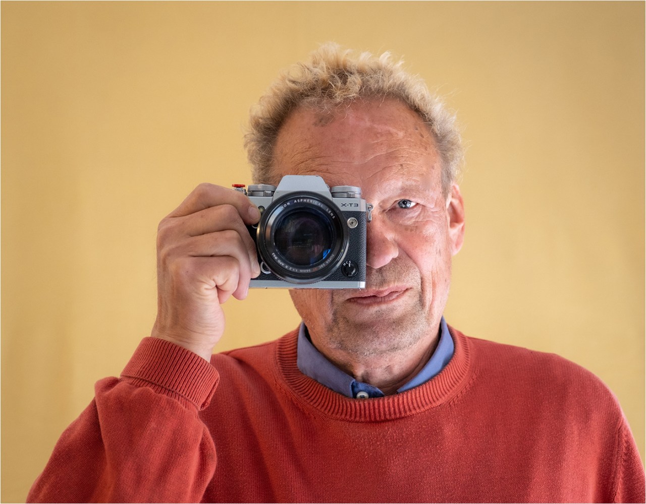
Just as important as the composition of an image, the choice of aperture and shutter speed, is the choice of colour, that it works exactly the way you want it to. Colours are fundamental to an image, and what’s more, photography is light art, so colours are fundamental to it. Fortunately, with programmes such as LR, Photoshop, Affinity and many more you can play around with colouring in a way that painters cannot. Given the possibilities of colouring through modern programs, even P.O. Runge and E. Delacroix would have turned green with envy. “May it be,” ask our clever fairies, “that one can create more subtle nuances of colours with light colours than with surface colours?”

Genauso wichtig wie Komposition eines Bildes, die Wahl der Blende und Verschlusszeit, ist die Wahl der Farbe, dass sie genau dearart wirkt, wie man es sich wünscht. Farben sind fundamental für ein Bild, und dazu kommt, dass Fotografie Lichtkunst ist und damit Farben grundlegend für sie sind. Zum Glück kann man mit Programmen wie z.B. Photoshop mit der Farbgebung in einer Weise herumspielen, wie es den Malern nicht gegeben ist. Angesichts der Möglichkeiten der Farbgebungen durch moderne Programme wären selbst P.O. Runge und E. Delacroix vor Neid erblasst. “Mag es sein“, fragen unsere Klugfeen, “dass man mit Lichtfarben subtilere Farbnuancen als mit Flächenfarben schaffen kann?”

The first thing Dina taught Siri 🙂 and 🙂 Selma that they should completely free themselves from their subject, from seeing it as it is, i.e. in our case what colour it has. The photographed original is nothing more than a means of production with which you do something, she explained. It depends on what you want to express and how this can best be done with the colouring. Among other things, the geometric view of the camera is thus transferred into a psychological way of seeing as a human being does.

Als erstes brachte Dina Siri 🙂 und 🙂 Selma bei, dass sie sich völlig von ihrem Motiv frei machen sollen, eben davon, es so zu sehen, wie es ist, d.h. in unserem Fall welche Farbe es hat. Das fotografierte Original ist nichts anderes als ein Produktionsmittel, mit dem man etwas macht, erklärte sie. Es kommt darauf an, was man ausdrücken will und wie dies am besten mit der Farbgebung zu bewerkstelligen ist. Die geometrisch Sicht der Kamera wird u.a. so in eine psychologische Sehweise des Menschen übertragen.
Reality and truth are always dubious concepts
David Hockney, Martin Gayford “A History of pictures”
With every object that you photograph, you should think about what effect you want to create and how. ‘What potential does this picture have?’ is the productive question. The impact or the mood of the image is what matters. Siri 🙂 and 🙂 For example, Siri 🙂 loves to play around with how a picture looks with a cold or warm background. Dina also showed them how you can not only make the colours of a single object lighter or darker but also change them to warm or cold colours or colours with different degrees of saturation. Especially Selma 🙂 loves the colour enhancement. You see, each picture not only gives a personal view of the world but also creates a certain reality. Colour processing gives the world a richer, more emotional feel than an unprocessed photo.
Man sollte bei jedem Objekt, das man fotografiert, sich bei der Bearbeitung überlegen, welche Wirkung möchte ich wie erzeugen. Welches Potential hat dieses Bild? lautet die produktive Frage. Die Wirkung bzw. die Stimmung des Bildes ist es, worauf es ankommt. Siri 🙂 und 🙂 Selma lieben es, damit herumzuspielen, wie ein Bild z.B. mit kaltem oder warmen Hintergrund wirkt. Dina zeigte ihnen auch, wie man die Farben eines einzelnen Objektes nicht nur heller oder dunkler machen kann, sondern sie auch zu warmen oder kalten Farben oder Farben mit verschiedenen Sättigungsgraden verändern kann. Besonders Selma 🙂 liebt die Farbverstärkung. Ihr seht, jedes Bild gibt nicht nur eine persönliche Sichtweise der Welt wieder, sondern schafft auch eine bestimmte Realität. Farbbearbeitung gibt die Welt reicher da emotionaler wieder als ein unbearbeitetes Foto.
Operating the programmes in such a way that they produce exactly the desired effect of an image is what modern photography is all about. Image editing counts. Of course, it helps to have a ‘good’ image as a basis. If you have certain aesthetic demands on your picture, you can’t avoid editing it, because a picture has long since ceased to be mainly a reproduction of reality that is as accurate as possible, as it was with Constable, but something that is supposed to evoke a certain reaction in the recipient, which is shaped by the tradition of imagery, among other things.
Die Programme derart zu bedienen, dass man mit ihnen exakt die gewünschte Wirkung eines Bildes erzeugt, ist es, was moderne Fotografie ausmacht. Die Bildbearbeitung zählt, wobei es hilft, ein ‘gutes’ Bild als Grundlage zu haben. Wer gewisse ästhetische Ansprüche an sein Bild hat, der kommt nicht um dessen Bearbeitung herum, denn ein Bild ist schon lange nicht mehr wie bei Constable hauptsächlich eine möglichst genaue Wiedergabe der Realität, sondern etwas, das im Rezipienten eine bestimmte Reaktion hervorrufen soll, was u.a. von der Tradition der Bilderwelten geprägt ist.
It is not usually known that digital cameras can only see shades of grey, not colour. Each camera manufacturer has written its own programme to convert the different shades of grey into that shade’s respectful colour. This is where the differences come from when you photograph the same colour with different cameras. The colour conversion programme is added as a standard feature into the camera’s software to enable users to automatically instantly see their images in colour. Dina noted the different colour conversion programmes under the pictures.
Es ist wohl wenig bekannt, dass Digitalkameras nur Grautöne sehen, keine Farben. Die Kamerahersteller haben ihre eigenen Programme, wie die Kamera die Grautöne in Farben umsetzt. Daher kommen die Unterschiede, wenn man die gleiche Farbe mit unterschiedlichen Kameras fotografiert. Das Farbübertragungsprogramm ist in die Software der Kamera integriert, so dass der Nutzer sofort die entsprechende Farbe sieht. Dina hat die unterschiedlichen Farbübertragungsprogramme unter den ensprechenen Bildern angeführt.
By the way, even when we look at the world in everyday life, we edit the images we see, because we see far too much.
Übrigens, auch wenn wir im Alltagsleben die Welt betrachten, bearbeiten wir die Bilderwelten, die wir sehen, denn wir sehen viel zu viel.
Warm greetings from the sunny sea
Mit herzlichen Grüßen vom sonnigen Meer
The Fab Four of Cley
🙂 🙂 🙂 🙂
.
.
© Text and illustrations, Hanne Siebers and Klausbernd Vollmar, Cley next the Sea, 2022

You are both looking so well and happy! Great to see you both on top form!
Love from Beetley, Pete and Ollie. X
LikeLiked by 3 people
Aha! You found it! X
LikeLiked by 1 person
My other comment did not appear!
LikeLiked by 2 people
Oh dear, we are very sorry, dear Pete. Now we’ll have a big search for it. Selma 🙂 is usually very good finding something lost.
The Fab Four of Cley
🙂 🙂 🙂 🙂
XX
LikeLiked by 5 people
Not to worry, KB. I have no idea why it didn’t post. x
LikeLiked by 1 person
You see, Selma 🙂 found it
LikeLiked by 2 people
What I’m usually searching for when I edit is the truest version of what I think I saw, Klaus. I delude myself, of course.
LikeLiked by 3 people
Dear Jo
We are less concerned with documentation and what we actually saw than with the image. The image is what matters to us and we see an image as part of the reality of the images rather than of any other realities.
Thank you very much for commenting
The Fab Four of Cley
🙂 🙂 🙂 🙂
LikeLiked by 3 people
I tend to disagree with your concept of colour in photography: it is a good photograph when stripped of colour. The latter is an addendum. Adding to that is the matter of composition, be it dynamic or static…
LikeLiked by 2 people
Hi Javier,
colour is an integral part of a picture. We wanted to show how to play around with colour to achieve exactly this effect you like.
Thanks and cheers
The Fab Four of Cley
🙂 🙂 🙂 🙂
May we ask you a question, please? How do you define a ‘good photograph’?
LikeLiked by 2 people
I still disagree. Look at any traditional painting and strip it of its colour. It will still contain a story through its theme and composition.
LikeLiked by 1 person
What is a good photograph? Your option is as good as mine. The snapshots in your example are just that: snapshots. If you consider the examples of good photographs, we’ll, what can I say… your choice
LikeLike
Hi Javier
When Hanne’s pictures were published by national newspapers like the Guadian, Independent and others there was a discussion about what is a good photograph. We suppose it depends on the media for which you produce a picture. It’s always interesting to hear the judge’s idea of a photograph when Hanne-Dina takes part in a competition.
The story seems to me not the non-plus-ultra of a picture. Think of all the abstract pictures. The drama and the story a picture should tell sound to me like a neo-romantic cliche.
Thanks a lot for answering.
All the best
The Fab Four of Cley
🙂 🙂 🙂 🙂
LikeLike
I thought further on your question and came to the conclusion that it not a fair question at all. From Barthes’ ‘camera lucida’ to Sontag extensive writing on photography, it is impossible to define what is a good photograph, including your irrelevant comment about neo-romanticism.
Equally one could ask what is a good poem, a good novel, a good painting etc. etc.
There are so many types of photography that it is meaningless to ask what or which is a good one.
LikeLiked by 2 people
Hi Javier
Funny, you used the expression ‘good photograph’, we didn’t!
What’s ‘good art’ depends on the zeitgeist. For a long time in history, normative aesthetics answered this question, in modern and post-modern times we tend to say everything goes. Anyway, I suppose a ‘good’ question makes you think, doesn’t it?
Thanks & cheers
Klausbernd 🙂
LikeLiked by 1 person
Well, I didn’t bring up the subject of what is a good photograph: you asked me that question on my very first comment, if you read the whole thread…
LikeLike
You did.
LikeLike
This is what you asked way back:
May we ask you a question, please? How do you define a ‘good photograph’?
LikeLiked by 1 person
Because you used the expression ‘good photograph’ first.
LikeLiked by 1 person
Yes, because your examples WERE photographs I assumed that it was the subject under consideration. If you had shown paintings, it would have been silly of me to bring the subject of photography to the fore, don’t you think?
LikeLiked by 1 person
My dear friends,
first of all, we have to see that you speak here about colours of light and about the differences between the geometrical seeing of the camera and the psychological seeing of humans.
Painters tried to produce the illusion of three dimensions in a two dimensional picture by colour before Leonardo used the line perspective. Shades of blue made the background and shades of yellow the foreground. If we work with colour we work with space as well.
With lots of love to you all. I hope you are healthy and happy. We have to phone soon when I am back home
❤ ❤ xx
Annalena
LikeLiked by 4 people
Good morning, dear Annalena,
you make an interesting point: colour produces space. Especially Kandinsky and his Bauhaus colleges were interested in this property of colour. Therefore Kandinsky called blue ‘zentripetal’ and yellow ‘zentrifugal’. The photographer, as well as the painter, can do quite some magic tricks with colour. Colour invites us to be creative.
Sending you big hugs 🤗 🤗 from all of us
The Fab Four of Cley
🙂 🙂 🙂 🙂
LikeLiked by 1 person
Wie schön Euch so farbenfroh und fröhlich zu erleben!
Liebe Grüße
U+H
LikeLiked by 3 people
Danke, liebe Uschi. Uns geht es gut und wir sind froh so viel Zeit zu haben, um mit Farben spielen zu können.
Herzliche Grüße nach Frankfurt
The Fab Four of Cley
🙂 🙂 🙂 🙂
LikeLike
Dear Klausbernd,
as to “Fortunately, with programmes such as LR, Photoshop, Affinity and many more you can play around with colouring in a way that painters cannot” I beg to disagree. To my mind no camera nor any photoshopping software can beat “real” painting.
Btw, Dina and you look good!
Have a wonderful day,
Pit
LikeLiked by 5 people
Das gilt es zu beweisen 😀
LikeLiked by 2 people
Ich fuerchte, beweisen kann ich das nicht.
LikeLiked by 2 people
Das ist ja eine kühne Behauptung, lieber Pit.
Die gegenteilige Meinung vertrat schon Goethe in seiner Farbenlehre, dass nämlich Flächenfarben mit jedem Mischvorgang mehr ergrauen. Man kommt beim Mischen von Flächenfarben schnell zu ‘Missfarben’ wie Goethe sie nannte. Das ist bei Lichtfarben und deren additiven Mischung völlig anders. M.E. liegt ein Unterschied zwischen subtraktiver Mischung der Flächenfarben und additiver Mischung der Lichtfarben, dass Lichtfarben sich häufiger mischen lassen bis sie im Weiß verschwinden.
Herzlichen Dank für dein Kompliment
The Fab Four of Cley
🙂 🙂 🙂 🙂
LikeLiked by 1 person
Lieber Klausbernd,
“Das ist ja eine kühne Behauptung” – genau das habe ich mir auch gedacht, nachdem ich auf “post comment” geklickt hatte. 😉 Vor allem, weil es eben einfach eine Behauptung ohne Beleg ist – etwas, was ich von meinen Schuelern immer anders verlangt habe. Oh je, jetzt bin ich meinen eigenen Grundsaetzen untreu geworden. 😉
Ich denke aber wirklich, dass die Malerei kreativer sein kann als die Fotografie. Vielleicht muss ich aber Deinen Beitrag hier auch erst einmal genauer lesen. Ich war je etwas schnell bei der Hand mit meiner Meinung.
Liebe Gruesse, und macht’s gut im kleinen Dorf am grossen Meer,
Pit
LikeLiked by 1 person
Lieber Pit,
naja, das ist doch normal im Alltag, dass man kühne Behauptungen von sich gibt. Ja, ja, so wird der Lehrer wie seine Schüler, das nenne ich Flexibilität 😉
Ich sehe die Malerei nicht kreativer als die Fotografie an. Die unterschiedlichen Progamme so zu bedienen, dass man mit ihnen genau das ausdrückt, was man sich vorstellt, halte ich für genauso kreativ wie das Schwingen des Pinsels. Es dauert auch genauso lang, das zu lernen. Well, was ist kreativer? Ich denke mir, Kreativität kann man nur mit der Anzahl Ausdrucksmöglichkeiten messen. Aber wie gesagt, es ist schwierig Lichtfarben mit Flächenarben zu vergleichen. Im Grunde sind das ja ‘two cups of tea’. Jedes Medium begenzt und legt uns fest, die Pigmentfarben und der Pinsel oder die Spraygun genauso wie die Software beim Computer und die Gesetze der Lichtfarben.
Mit lieben Grüßen in den wilden Westen, halte dich froh und munter
The Fab Four of Cley
🙂 🙂 🙂 🙂
LikeLiked by 1 person
Lieber Klausbernd,
“Ich sehe die Malerei nicht kreativer als die Fotografie an. Die unterschiedlichen Progamme so zu bedienen, dass man mit ihnen genau das ausdrückt, was man sich vorstellt, halte ich für genauso kreativ wie das Schwingen des Pinsels. Es dauert auch genauso lang, das zu lernen. Well, was ist kreativer?”
Danke fuer Deinen weiteren Kommentar. Dem stimme ich zu, und revidiere also – etwas – meine apodiktische Behauptung. 😉 Und on man entscheiden kann, was kreativer ist? Wohl schwerlich.
Liebe Gruesse von einem absolut unkreativen [und das meinen ich in vollem Ernst] Menschen,
Pit
LikeLiked by 1 person
It really isn’t a competition. Each medium has it’s merits and demerits. A cow is definitely not as good as a horse on the race course but a cow is better than a horse in milk production
LikeLiked by 2 people
Dear Javier,
we absolutely agree.
Wishing you a wonderful weekend
The Fab Four of Cley
🙂 🙂 🙂 🙂
LikeLike
Great photos, you two look wonderful! Be safe and well.
LikeLiked by 3 people
Thank you very much, dear John 🙏 🙏
Wishing you a wonderful week
The Fab Four of Cley
🙂 🙂 🙂 🙂
LikeLiked by 1 person
Tout l’Art de la photographie !
LikeLiked by 3 people
Indeed, our post is about the art of photography, and how to be creative as a photographer.
Thanks and cheers
The Fab Four of Cley
🙂 🙂 🙂 🙂
LikeLiked by 1 person
Great post Klaus.
LikeLiked by 4 people
THANK YOU 🙏 🙏
Keep well and happy
The Fab Four of Cley
🙂 🙂 🙂 🙂
LikeLike
A very informative post. You both look great in any color combination. I did like the B&W shotas well.
LikeLiked by 4 people
Dear John,
thank you very much. We very much liked to read your comment 🙂 🙂
We love B&W shots too, they appear more graphical.
All the best
The Fab Four of Cley
🙂 🙂 🙂 🙂
LikeLiked by 1 person
😁
LikeLiked by 1 person
schönes Paar, da gibt es doch gar nicht so viel darüber nachzudenken😀 Macht Euch die Welt. wie sie Euch gefällt. Egal was man tut, es wird immer unterschiedliche Meinungen geben. Wichtig ist nur, das man sich treu bleibt…
LikeLiked by 2 people
… und dass man mit seinen Möglichkeiten spielt, dieses und jenes ausprobiert.
Habe ganz, ganz herzlichen Dank für deinen Kommentar, der uns gut tut
The Fab Four of Cley
🙂 🙂 🙂 🙂
LikeLiked by 1 person
A great post, inviting differences of opinion! For my part, I will use aperture, shutter speed etc in camera, and then make further adjustments in post processing and decisions around colour or B/W…..all to produce an image that reflects the scene in my mind
LikeLiked by 3 people
Dear Sue,
exactly, that’s how Dina is working as well.
Important is that one has an idea of what the picture should look like, which means what you want to express.
Thank you very much
The Fab Four of Cley
🙂 🙂 🙂 🙂
LikeLiked by 1 person
Yes! Thanks, Klausbernd!
LikeLiked by 1 person
🙂
LikeLiked by 1 person
Absolutely Sue, I agree. First, get the image right in camera and then the fun can begin.
A regular critique from judges in the camera club; “so what … it lacks punch, it’s flat (boring) …” Clarity, sharpening, vibrance and punch can transform a scene.
Unless it’s natural history, I normally don’t care about what a scene looked like. I see a scene and I see possibilities to enhance and maybe create something beyond the scene in post-processing. I must admit, that’s for me the greatest fun and pleasure.
Thanks for visiting and commenting
Dina-Hanne 📷🌿💐
LikeLiked by 2 people
We appear to be on the same page, Hanne!
LikeLiked by 1 person
Hmmm. Colors, as only we human beans know how to distinguish, discriminate, perceive. Great tutorial. 👏
LikeLiked by 4 people
Thanks a lot, dear John.
Playing with colour makes us perceive more exact – hopefully.
Keep well
The Fab Four of Cley
🙂 🙂 🙂 🙂
LikeLiked by 1 person
Danke für die Info mit den Grautönen.
Farbe ist kritisch:
Ich hatte schon mal die Idee, ein bestimmtes Insekt zig mal zu zeigen, in all den unterschiedlichen Farbnuancen, auf die man beim Fotografieren bei diesem Insekt trifft.
Strukturfarben, strahlquellen vieler art, wie indirektes licht machen es schwer bis unmöglich, Farben zuzuschreiben.
Ich hatte mal hier auch erwähnt, dass ein Bild von Edward hopper (opernloge) in unterschiedlichen Katalogen recht unterschiedlich gedruckt wurde.
LikeLiked by 3 people
Guten Morgen, lieber Gerhard,
du machst auf etwas Wesentliches aufmerksam, dass nämlich Farbe vom Licht, also von ihrer Beleuchtung, abhängig ist. Deswegen wurde von vielen wie Goethe, einigen Bauhauskünstlern und Designern Violett abgelehnt, da es die Farbe ist, die unter unterschiedlichem Licht sich am meisten verändert.
Die unterschiedliche Wirkung des Bildes von Hopper in unterschiedlichen Katalogen finden wir genau zu dem Punkt hier. Wenn Dina ihre Bilder für Wettbewerbe drucken lässt, diskutiert sie die Farbeinstellung ausführlich mit dem Drucker, um genau die Wirkung zu erreichen, die ihr wichtig ist.
Mit lieben Grüßen vom heute grauen Meer
The Fab Four of Cley
🙂 🙂 🙂 🙂
LikeLiked by 1 person
Habe den Artikel an jemanden weiterempfohlen, der ähnliches gepostet hatte…
LikeLiked by 1 person
Habe herzlichen Dank, lieber Gerhard 🙏🙏
Kannst du uns bitte auch seine Seite nennen?
Liebe Grüße
The Fab Four of Cley
🙂 🙂 🙂 🙂
LikeLiked by 1 person
Ja, vermutlich kennst Du sie:
https://hjschlichting.wordpress.com/2022/05/31/spiegel-und-schattenwelt/
LikeLiked by 1 person
Danke! Ja, die Seite kenne ich.
LikeLiked by 1 person
Interesting! Idid not know that the camera only sees grey and the camera’s programs “colorize” it. I remember back in the days of film I used to set the ASA to a different number (higher I think)than what was recommended and then the color was more saturated.
LikeLiked by 3 people
Hi Anne,
yes, I vaguely remember this alternative. The increased saturation used in this colour pop is due to soft light blending modes, vibrance and vivid light without pushing the saturation slider.
Thanks for visiting and commenting
Dina-Hanne 📷🌿💐
LikeLiked by 1 person
Dear Anne,
yes, I remember that you change the saturation with the ASA in former times. With digital photography, we are able to change so much more.
Thanks for commenting
The Fab Four of Cley
🙂 🙂 🙂 🙂
LikeLiked by 1 person
Very effective, the examples. I spent a lot of time learning Photoshop. What a powerful program.
LikeLiked by 4 people
Hi Jacqui,
you’re right – PS is very powerful and packed with possibilities beyond the basics to create something unique with blending modes, temperature and vivid-vibrant colours.
Thanks for visiting and commenting
Dina-Hanne 📷🌿💐
LikeLiked by 2 people
Good morning, dear Jacqui,
we remember a friend of ours who worked in advertising, she had a whole shelf full of Photoshop manuals and one employee just for operating more complicated Photoshop tasks.
Thanks for your comment.
Wishing you a happy day
The Fab Four of Cley
🙂 🙂 🙂 🙂
LikeLiked by 1 person
I think you gave directions for creating the bubble picture with PS, if memory serves. I’m looking for a reason to try that!
LikeLiked by 1 person
I am sure you will find one soon.
LikeLiked by 1 person
Thank you for this fascinating treatise. Although I am never likely to edit my diary photographs as much as your team you have certainly given me food for thought
LikeLiked by 1 person
This is what we wanted, dear Derrick
Thanks and cheers
The Fab Four of Cley
🙂 🙂 🙂 🙂
LikeLiked by 1 person
In processing a photograph, I often find more than one color scheme that still seems natural, as you’ve demonstrated here.
LikeLiked by 1 person
Dear Steve,
yes, one can choose depending on what one wants to express or what you want to make the onlookers feel.
Thanks and cheers
The Fab Four of Cley
🙂 🙂 🙂 🙂
LikeLike
Ich finde es spannend, wie man mit leichten Farbveränderungen große Unterschiede in der Stimmung erzeugen kann.
Liebe Grüße
Sabine
LikeLiked by 1 person
Liebe Sabine,
es ist erstaunlich, welche großen Einfluss die Farbe auf unsere Stimmung hat, selbst kleine Änderungen der Nuancen. Damit zu spielen, gibt einem eine Idee, wie man seine Bilder verbessern kann. Man sollte sich bei jeden Ursprungsbild überlegen, welches Potential es in sich trägt. Um das auszuschöpfen, hilft es über die Farbgestaltung nachzudenken.
Vielen Dank.
Mit lieben Grüßen vom heute grauen Meer
The Fab Four of Cley
🙂 🙂 🙂 🙂
LikeLike
Dina – you bring magic into your photos whether they are colour or shades of grey. I have come back a couple of times to read your insights on the use of colour in photography. I especially appreciated these words:
“By the way, even when we look at the world in everyday life, we edit the images we see, because we see far too much.”
You have given me much to think about in the coming week. Sending much love and many hugs to my dear friends, The Fab Four of Cley.
LikeLiked by 2 people
Good morning, our dear friend Rebecca,
thank you so much for your kind words.
We edit all the time what we see. What we see is depending on our motivation and what we know. Therefore different people see a different reality.
We send you and your family big hugs 🤗 🤗 across the big waters, keep well and happy
The Fab Four of Cley
🙂 🙂 🙂 🙂
LikeLiked by 1 person
The Budd family thanks you for your warm greetings. We are having coffee with Frances, my mother and Sarah, my sister. They send their greetings as well. I just want to add that Dina’s photography awakens us to the present. It is truly a gift and I am glad that she shares it with us. A generous spirit indeed!
LikeLiked by 2 people
Your warm greetings are 💞 returned, Rebecca. You have the most radiant personality, great ideas to reach out and connect with a standing invitation to explore the unknown and rediscover the familiar.
I can vividly imagine what a memorable time you have with Frances, Sarah. 🥰☕️📖
We are getting ready for the Jubilee marathon. I’m photographing on behalf of the village, a new adventure requiring a new approach and we are ready to dive right in. 🫅💂♀️🇬🇧🎊
Hugs to all the Budds!🤗🤗🤗🤗🤗
LikeLiked by 2 people
Looking forward to seeing your photos, Dina!!! Can hardly wait.
LikeLike
♥️🌿💐
LikeLiked by 2 people
Although we are not royalists we are taken by all the preparations for today. I suppose we will blog about next everything that’s going on in our village.
With lots of love
Klausbernd 🙂
LikeLiked by 1 person
Good morning, this is a great post and has given me some ideas for my own photography. Have a great Thursday.
LikeLiked by 1 person
Dear Roberta,
thank you.
It’s great that we gave you an idea of what to do with colour. Actually, that’s what we want with our blogposts: giving ideas.
Wishing you a wonderful week
The Fab Four of Cley
🙂 🙂 🙂 🙂
LikeLiked by 2 people
Thanks for showing us the magic of color! Beautifully done!
LikeLiked by 1 person
Dear Amy,
you are very welcome.
Wishing you a wonderful weekend
The Fab Four of Cley
🙂 🙂 🙂 🙂
LikeLike
Love the photos, information, and your take on what we get when we take pictures rather than what we hope for. Excellent shares with information I can use!
LikeLiked by 1 person
Thank you so much for your kind words 🙏🙏
Great that you can use our info.
Wishing you a wonderful week
The Fab Four of Cley
🙂 🙂 🙂 🙂
LikeLiked by 2 people
Indeed, colour is important if you go for a colour photo. But you can also process images in monochrome. I think it depends on which effect you would like to archive.
When I process pictures I’m mostly busy with processing light and darkness. Certainly I also pay close attention to the colours and tones. But for me they are more like the icing on a cake.
LikeLiked by 3 people
Dear Rabirius
Interesting that you see the colours like icing on a cake. We love that expression.
With colour and colour combination, we can determine how the onlookers react to a picture which is mostly unconscious. We produce a mood.
Thank you 🙏🙏
Have a happy week
The Fab Four of Cley
🙂 🙂 🙂 🙂
LikeLiked by 1 person
Jetzt habe ich so ganz nebenbei viel gelernt und ein paar Denkanstöße mitgenommen. Ich denke ja nicht so viel nach bei der Bildbearbeitung, sondern folge meinen Intuitionen. Danke und liebe Grüße an alle Vier! Regine
LikeLiked by 2 people
Liebe Regine,
na, das ist ja toll, dass wir dir Denkanstöße gegeben haben. Habe eine wunderbare Woche
The Fab Four of Cley
🙂 🙂 🙂 🙂
LikeLiked by 2 people
Reblogged this on .
LikeLiked by 1 person
Thank you very much 🙏🙏
We are sooo sorry we missed it.
Have a happy weekend
The Fab Four of Cley
🙂 🙂 🙂 🙂
LikeLiked by 1 person
Thank you 🙂
LikeLiked by 2 people
What a beautiful post! The best part is definitely the models ~ wow 🙂 Quite attractive and they also serve to make the important point of your post, the importance of color. I’ve never thought about color much when I go out on a shoot, it is always the more technical aspects (aperture, lighting, and then the perspective (POV, motion, etc…)… but then I realize that I also think about color in an almost unconscious way. The lighting is always perhaps at the top of my mind, such as how the golden hour move me and most all photographers… and from that I link with color as well, as it creates the awe of photos. You demonstrate the awe of color and importance of post-processing with this post. I love the comment “Dina taught Siri 🙂 and 🙂 Selma that they should completely free themselves from their subject…” because it explains well what I wrote above, and then you add how in processing it is important to get across to the audience the feel you had when you were photographing. Beautiful post, beautiful photos, and beautiful writing… seriously what more could you ask 🙂 Wishing you a brilliantly colorful summer ~
LikeLiked by 2 people
Thanks a lot, dear Randall for your lovely comment that made us smile 🙂 🙂 🙂 🙂
We love to think about colour, well, our dear master wrote several books about the impact and symbolism of colour. The German writer J.W. von Goethe said a couple of days before his death that history could forget about all his writings except his Theory of Colour. Turner was quite influenced by his Theory of Colour – and our dear master 😉
Keep well and have a happy summer
The Fab Four of Cley
🙂 🙂 🙂 🙂
LikeLiked by 1 person
Nice
LikeLiked by 1 person
THANK YOU 🙏 🙏
The Fab Four of Cley
🙂 🙂 🙂 🙂
LikeLike
Pingback: Primary Colours | FabFourBlog