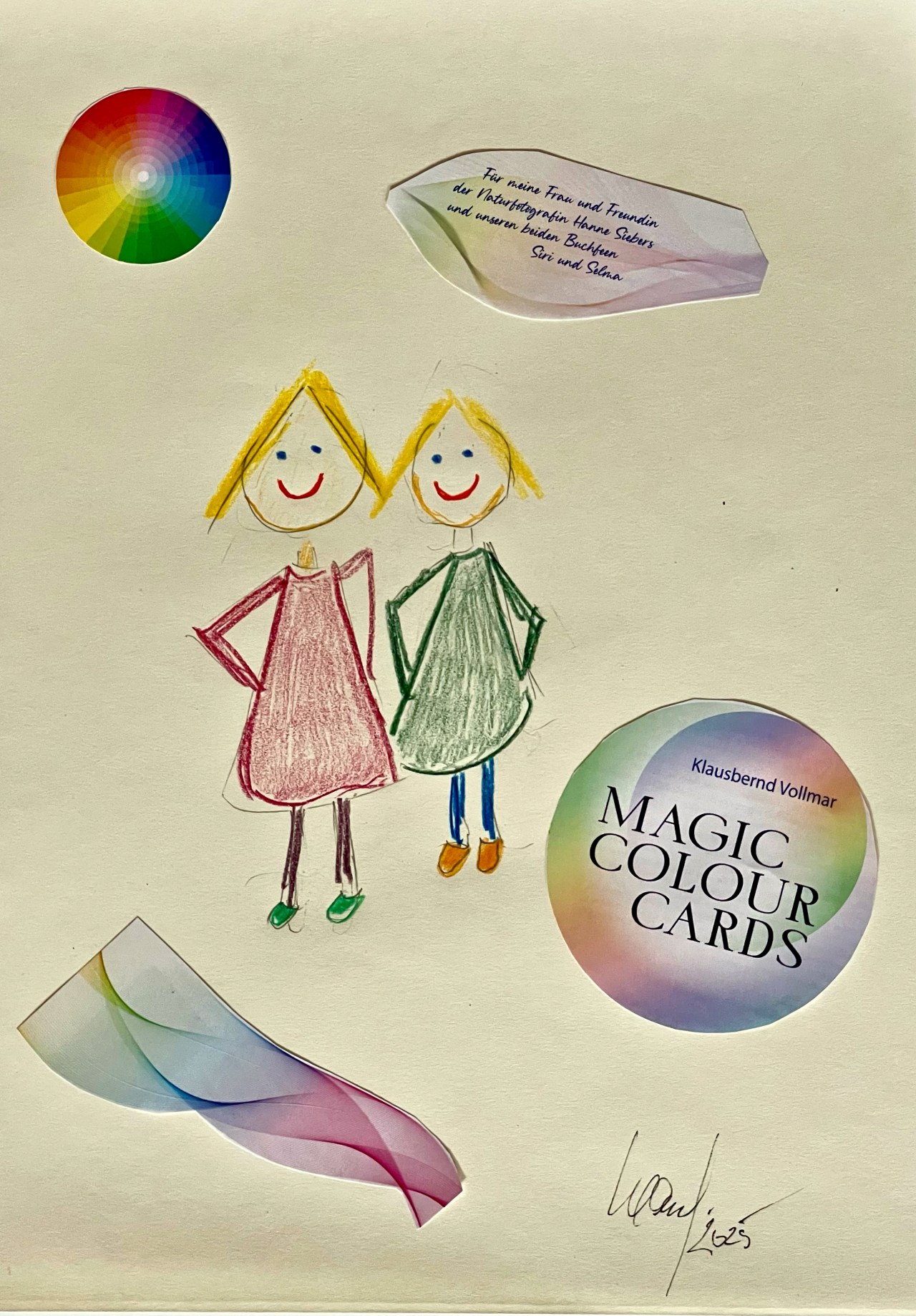
Siri and Selma couldn’t be stopped from blogging about Kb’s latest project.
Do you know why? Kb has dedicated the extensive book to his colour cards to them. They are bursting with pride and need to show it off to everyone. It’s also dedicated to Dina, who has designed this blogpost beautifully. Unfortunately, the book with the cards is only available in German. But who knows, maybe Kb’s publishing house will sell an English licence.
Siri und Selma waren nicht davon abzuhalten, über das neueste Projekt von Kb zu bloggen.
Wisst ihr warum? Kb hat ihnen das umfangreiche Buch zu den Farbkarten gewidmet. Sie platzen vor Stolz und müssen es allen zeigen. Es ist auch Dina gewidmet, die diesen Blogpost wie immer wunderschön gestaltet hat. Leider gibt es das Buch mit den Karten nur auf Deutsch. Aber wer weiß, vielleicht verkauft Kb’s Verlag eine englische Lizenz.

This book on the colour project is about the language of colours, which is almost more logical than our spoken language. Colour speaks to us, red says ‘STOP!’, green says ‘GO’, for example. Where there is language, there is also the often unloved grammar, the order of language elements and forms. The grammar of colours can be seen in the colour wheel. For example, complementary colours are opposite each other, warm and cold colours on different sides of the colour wheel. The colour wheel is also a good way to learn how to create subtle colour transitions, which we book fairies love.
In diesem Buch zu dem Farbprojekt geht es um die Sprache der Farben, die fast noch logischer aufgebaut ist als unsere gesprochene Sprache. Farbe spricht zu uns, Rot sagt “STOP!”, Grün sagt z.B. “GO“. Wo Sprache ist, da ist auch die oft ungeliebte Grammatik, die Ordnung und Form der Sprachelemente. Die Grammatik der Farben lässt sich am Farbenkreis ablesen. Da stehen sich zum Beispiel Komplementärfarben gegenüber, warme und kalte Farben auf verschiedenen Seiten des Farbenkreises. Am Farbenkreis kann man auch gut lernen, feinste Farbübergänge zu gestalten, was wir Buchfeen lieben.
Just as in the order of the numbers the always equal spacing of the natural numbers is disturbed by the distribution of the revolting prime numbers, so the beautiful regularity of the colours is disturbed by the different colour ranges. How long does a colour retain its character when another is mixed in? White is the most sensitive of all colours; even a small splash of colour from another colour makes it no longer appear white. Black and blue are much more stable.
Wie bei der Ordnung der Zahlen die immer gleichen Abständen der Primärzahlen durch die Verteilung der revoltierenden Primzahlen gestört wird, so wird die schöne Regelmäßigkeit der Farben durch die verschiedenen Farbreichweiten gestört. Wie lange behält eine Farbe ihren Charakter, wenn man eine andere einmischt? Weiß ist das Sensibelchen unter den Farben, schon kleine Farbspritzer einer anderen Farbe lässt es nicht mehr weiß erscheinen. Schwarz und Blau sind wesentlich beständiger.
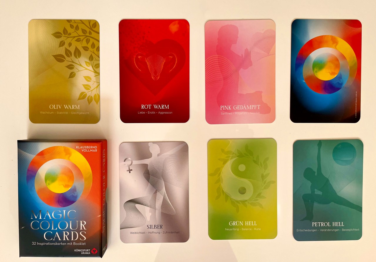
But that is only one part of the book and the beautifully designed colour cards. This colour project aims to learn how to use colours confidently. It is about the symbolism and the effect of colours, especially what to consider with the individual colours when dressing for special occasions and what you should bear in mind when decorating your home. The assignment of colours to the signs of the zodiac, planets and energy centres and the use of colours for healing are also covered.
Aber das ist nur ein Teil des Buches und der wunderschön gestalteten Farbkarten. Ziel dieses Farbprojektes ist es, den sicheren Umgang mit Farben zu erlernen. Es geht um die Symbolik und die Wirkung der Farben, vor allem darum, was zu den einzelnen Farben bei der Kleidung zu welchen Anlässen zu bedenken ist und was man bei der Inneneinrichtung beachten sollte. Aber auch die Zuordnung der Farben zu den Tierkreiszeichen, Planeten und Energiezentren sowie die Anwendung von Farben zur Heilung werden behandelt.
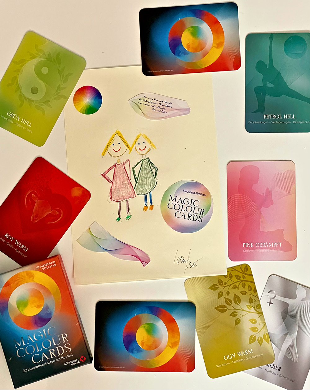
Siri and Selma’s final summary: ‘Here you’ll find everything you ever wanted to know about colours and the cards allow you to play with the colours.’ Just take a look here.
Siri und Selmas abschließendes Resumee: “Hier findet ihr alles, was ihr schon immer über Farben wissen wolltet und die Karten bieten euch die Möglichkeit, mit den Farben zu spielen.” Und seht ‘mal hier.
We wish you a colourful time
Wir wünschen euch eine farbenfrohe Zeit
Siri 😊 & Selma 😊
© text and illustrations, Hanne Siebers & Klausbernd Vollmar, Cley next the Sea, 2025

Such an interesting idea, and beautifully executed. Well done to KB, and good luck with the lovely new book! (And thanks to Hanne for the photos)
Love from Beetley, Pete. X
LikeLiked by 1 person
Thank you very much, dear Pete 🙏 🙏
It was fun working on this project. It was not without shock that I realised that this is my 14th book on the subject of colour. I hadn’t realised that either. But it was still lots of fun to write and to be involved in the designs.
Now I hope that my publisher will sell the English copyrights. Keep your fingers crossed, please.
Love from the sea
The Fab Four of Cley
🙂 🙂 🙂 🙂
LikeLiked by 1 person
💛
LikeLiked by 1 person
🙏 🙏 🙏 🙏
The Fab Four of Cley
🙂 🙂 🙂 🙂
LikeLike
Well, the cards certainly look colourful. I’m not so sure about the moods relating to colours but it’s obvious that some colours are warmer than others. I am sure the fairies will enjoy playing. xxxx
LikeLiked by 1 person
Dear Jo
Thank you very much.
Especially in medieval art moods and symbolism were closely related to colours. The painters used the colours partly like we use words nowadays.
Nowadays, students do their standard association experiments with colours.
Our Bookfayries do indeed enjoy playing with these cards.
All the best
The Fab Four of Cley
🙂 🙂 🙂 🙂
LikeLiked by 1 person
Interesting to know. Thanks, Klaus xx
LikeLiked by 1 person
Eine sehr schöne Idee sich intensiv mit der Magie der Farben zu befassen, wofür auch ich mich schon in Bezug auf positive Stimmung sowie Kleiderwahl interessierte, und offensichtlich nun auch perfekt in den Farbkarten umzusetzen, wozu Siri und Hanne sogar das Buch gewidmet wurde. Hochachtung dafür auch von mir und die Freude ist natürlich riesengroß!
Herzlichen Glückwunsch und liebe Grüße von Hanne 🌺
LikeLiked by 1 person
Herzlichen Dank, liebe Hanne.
Hanne und Siri betrachten die Farbe und Farbzusammensetzung meiner Kleidung stets sehr genau. Da gibt es kein Schlampen 😉 Aber ich finde das auch toll, stets mit den passenden Farben bekleidet zu sein. Ich liebte schon immer die Petroltöne, neuerdings habe ich die Grüntöne entdeckt, speziell die Kombination von warmen und kalten Grüntönen.
Die Karten bringen das spielerische Element, damit das alles nicht zu ernst wird.
Liebe Grüße vom kleinen Dorf am großen Meer
Klausbernd und der Rest der Gang
🙂 🙂 🙂 🙂
LikeLiked by 1 person
Congratulations on the publication of the book.
I think the topic is really fascinating, both for the more technical information and for the deeper and, I dare say, psychological implications
LikeLiked by 1 person
Dear Luisa
It’s incredible how many aspects of colours there are, from their psychological aspect and healing with colour to Fraunhofer Lines. So you can understand Goethe’s quote (from Faust II) “In the colourful reflection, we have life.” Or one could say life is colour as colour is life.
Thanks and cheers
The Fab Four of Cley
🙂 🙂 🙂 🙂
LikeLiked by 1 person
Thanks a lot for this wonderful reply, dear Klausbernd 🙏🌈
LikeLike
Fingers crossed for an English version!
LikeLiked by 1 person
Dear Fraggle
Publishers are always hesitant to sell English copyrights because English publishers sell less than most others. Therefore, quite a lot of important books are not translated into English.
Thanks
The Fab Four of Cley
🙂 🙂 🙂 🙂
LikeLiked by 1 person
😕
LikeLike
Fab Four of Cley,
Happy to hear of Kb’s latest accomplishment. I’m certain it will be quite a success.
What is the latest topic of interest for Hanne’s photography? Are Siri & Selma involved with anything there?
Have a great week.
GP
LikeLiked by 1 person
Dear GP
thank you very much.
Hanne is now very much interested in hares. She goes out early in the morning with Selma spotting hares in the fields. Siri rather helps Kb researching and inspiring him.
All the very best to our dear friend GP
The Fab Four of Cley
🙂 🙂 🙂 🙂
LikeLiked by 1 person
😊
LikeLike
Congratulations, Klausbernd. This is a brilliant project that I hope will one day be in English. I will be the first one in line to purchase it!! Colours are such a part of our lives and yet we take them for granted. We are influenced by colours, but we have very little knowledge of how much they dictate our emotional state. We do not consider the link between a specific colour and how that colour evokes feelings, creates atmospheres, and even affects our behaviors. I have enjoyed learning about colours through your blog and our conversations. I especially appreciate your thoughts on how colours play a role in cultural symbolism and personal expression, making them integral to our daily experiences and interactions.
A huge thank you to Dina/Hanne for the most amazing photography. Sending many hugs to our dear friends, the Fab Four of Cley!!
LikeLiked by 2 people
Our dear friend Rebecca
We love colours, Dina in photography and Kb in theory and in drawing with colour pencils. You are right, colours are a subtle way of expressing not only feelings but also opinions and views. Colours communicate without being obtrusive. Besides this, our world would be boring without colour, wouldn’t it?
Kb wrote a lot of books about colours and this is the one that combines them all.
It was fun working together with Dina, Siri and Selma, well, it’s always fun working together with them.
With many hugs 🤗 🤗 and love 💙💙💜💜
The Fab Four of Cley
🙂 🙂 🙂 🙂
LikeLiked by 1 person
This book looks gorgeous and very interesting. Congratulations on completing this project! It sounds like you have a great team working along side of you.
LikeLiked by 1 person
Good morning, dear Darlene
Thank you very much 🙏 🙏
Yes, I have a great team. I like to work together in a team, it inspires me. Books for the mass market are all produced by teams. An author like me needs teamwork skills, that’s basic.
Wishing you a wonderful week
Klausbernd 🙂
LikeLiked by 1 person
Such a delightful and intriguing project! I hope there will be an English version.
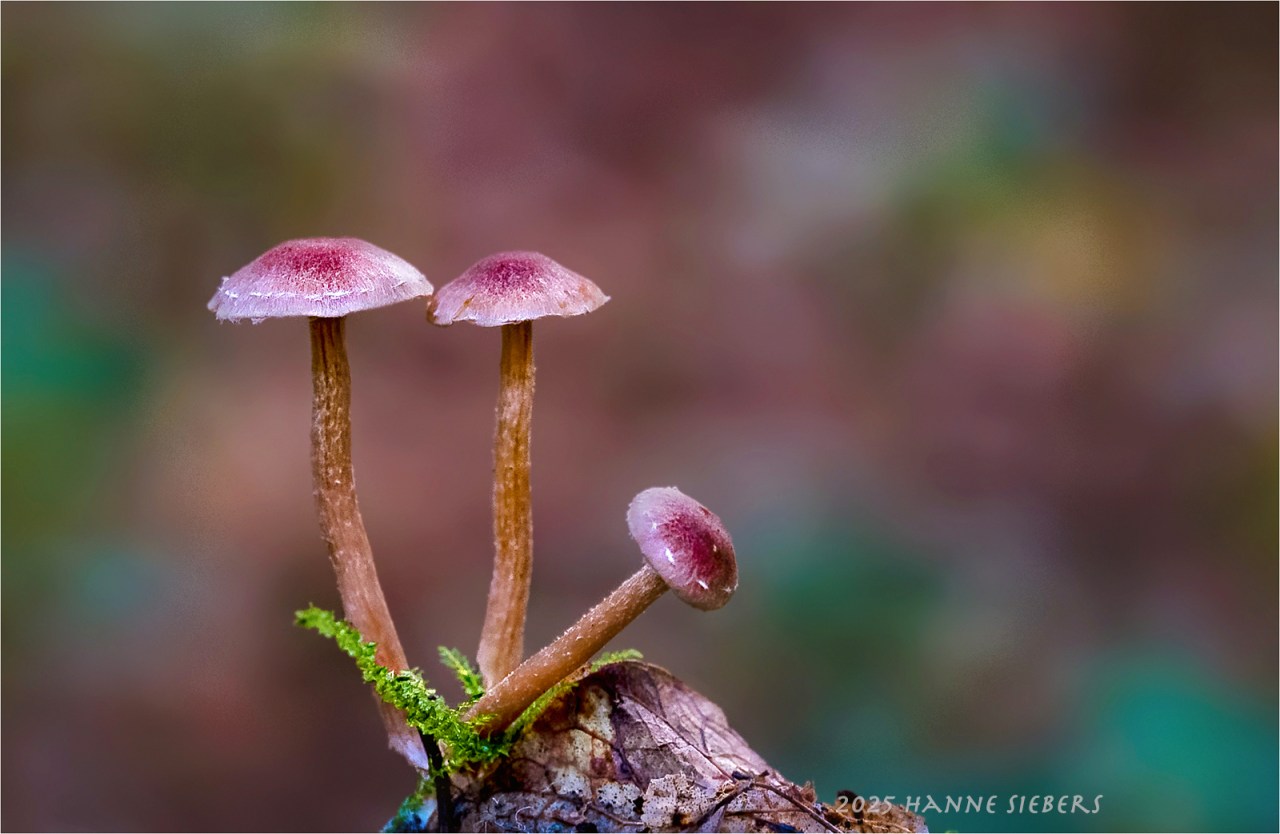
That is one of most beautiful fungi photos I have ever seen!
LikeLiked by 1 person
Ah, thank you very much for your kind comment on the fungi, Morgaine❣️ I’m glad you like it.🥰💫🌿🍄🟫
LikeLiked by 1 person
Dearest Mermaid
Thank you very much 🙏 🙏 It was fun to write this book.
All the best
Klausbernd 🙂
LikeLiked by 1 person
What symbolism is attached to blue please? As many variations as possible.
LikeLike
Blue is the most liked colour in the western world, because of its quieting effect. It’s the colour of Romanticism going back to Novalis’ novel and has to do with longing but also with fog and befuddlement. It’s the coldest colour of the colour circle and will be associated with depression.
These are just some few meanings of blue. Of course, it depends which shade of blue and the colours next to it.
Okay?
The Fab Four of Cley
🙂 🙂 🙂 🙂
LikeLiked by 1 person
Sharing…
LikeLiked by 1 person
Hi Jacqui
I didn’t come across that blue means sharing. Could you, please, be so kind to tell me in what connection blue means sharing.
Thanks and cheers
Klausbernd 🙂
LikeLiked by 1 person
Apologies for my lack of clarity. I simply meant I was sharing your post to my social media. More eyes need to read this!
LikeLiked by 1 person
Thank you VERY much, dear Jacqui. That is very kind of you ❤ ❤
Sorry, I was too stupid to understand this – oh dear.
I wish you all the best
Klausbernd 🙂
LikeLiked by 1 person
Congratulations. This post and the book are a work of art.
LikeLiked by 1 person
I hope people see it as a work of art. That would be ideal.
Thanks and cheers
Klausbernd
The Fab Four of Cley
🙂 🙂 🙂 🙂
LikeLiked by 1 person
Congratulations Klausbernd, it looks like a wonderful publication! 🎉
LikeLiked by 1 person
Thank you very much.
I am quite happy with it.
All the best
The Fab Four of Cley
🙂 🙂 🙂 🙂
LikeLiked by 1 person
Congratulations! An intriguing idea that looks temptingly executed.
LikeLiked by 1 person
Thank you very much, dear Margaret.
It took a while to find the right design, but now we are all happy with it.
All the best
The Fab Four of Cley
🙂 🙂 🙂 🙂
LikeLiked by 1 person
What an intriguing and beautiful project, Klausbernd. Congratulations on its publication! 👏🏻
LikeLiked by 1 person
Thank you very much, dear Jane 🙏 🙏
I love such projects where text and design come together to make something clearer.
Have a happy week
Klausbernd 🙂
LikeLiked by 1 person
All the best on your new project.
LikeLiked by 1 person
Thank you very much, dear John 🙏 🙏
The Fab Four of Cley
🙂 🙂 🙂 🙂
LikeLike
What a fun project. Well done, KB!
LikeLiked by 1 person
Thank you very much. It was fun to do it, I like doing such projects.
Keep well
Klausbernd 🙂
The Fab Four of Cley
🙂 🙂 🙂 🙂
LikeLike
Lieber Klausbernd,
leider bin ich rotgrünblind, was mir etwas das Thema “Farben ” vermiest.
Dennoch mag ich sehr Dein Projekt!
Vor 2 Tagen sprach ich mit einer Design-Professorin in Würzburg, die meinte, daß selbst ein nur 20% Sehender bei ihr studiert hätte.
Ich jedenfalls war vor 50 Jahren nicht in der Lage, auf ein Kunststudium zu setzen!
Mein einziger Trost hierbei ist, daß ich jetzt, mit 71, Künstlerisches tue. Und ich wäre vor 50 Jahren sicher nicht in der Lage gewesen, auf Kunst zu setzen. Dazu war ich nicht selbstbewusst genug und auch nicht zu autark.
LikeLiked by 1 person
Lieber Gerhard,
meine Schwester ist auch ein gutes Beispiel dafür, wie eine Sehschwäche einen nicht von einer Beschäftigung mit der Kunst abhalten muss. Meine Schwester hat auch nur etwa 20% Sehkraft, ist aber eine Spezialistin für moderne und post-moderne Kunst.
Ich finde es erstaunlich, wie viele Menschen ich treffe, die farbenblind sind – meist rotgrünblind. Es sind wohl 8% aller Männer und 0.5% aller Frauen.
Erfreue dich weiterhin an deiner Kunst
Klausbernd 🙂
LikeLiked by 1 person
8% ist viel. Kann ich fast nicht glauben, dann wäre es wirklich ein universelles Problem.
Danke, Klausbernd. Ich fühle mich der Kunst vernunden – als aktiver und auch als Besucher von Ausstellungen.
LikeLiked by 1 person
Lieber Gerhard
Die Zahl erinnerte ich noch aus meinem Psychologiestudium. Ich überprüfte sie noch einmal mit ChatGPT und erhielt die gleichen Werte.
Mach’s gut
Klausbernd 🙂
LikeLiked by 1 person
Dann ist das wirklich eine hohe Zahl.
Danke Dir, Klausbernd!
LikeLike
Congratulations on the book! Ich liebe farbe! Especially as it relates to photography and the colors of clothing people wear that complement skin tone and mood. Amazing science behind it.
LikeLiked by 1 person
Dear Terri
Thank you very much.
I like that colour is very systematic, but it has an artistic side to it as well. I originally came from the scientific side to colour and from Goethe’s “Theory of Colour”.
Thank you very much
Klausbernd 🙂
LikeLiked by 1 person
I’ll have to look that up!
LikeLiked by 1 person
The old Goethe said shortly before his death that of all texts he wrote, ‘The Theory of Colour’ was the most important.
LikeLiked by 1 person
How fascinating & wonderful.
LikeLiked by 1 person
Dear Cindy
Thank you very much 🙏 🙏
Keep well and happy
Klausbernd 🙂
LikeLike
If your book does come out in English I’ll have to get it for my two grandsons. I’m colorblind, so I appreciate your wanting to help people see and understand color. Thanks very much.
LikeLiked by 1 person
We found out that 8% of all men are Red-Green-Colourblind but only 0.5% of all women. We thought about this big difference. One explanation we read: Women were in charge of collecting eatable plants. There colour is important to show how ripe they are.
Thank you very much
The Fab Four of Cley
🙂 🙂 🙂 🙂
LikeLiked by 1 person
Yes, I am red-green colorblind. It’s fairly common here but very hard to explain to a non colorblind person.
Colorblindness interfering with the collecting of edible plants makes perfect sense. I have a hard time identifying some plants because of it.
LikeLiked by 1 person
Yes, that makes sense.
LikeLike
Sincere congratulations on your new book on a subject about I know very little. Do hope an English language version will appear on our book shelves to expand our interest and knowledge. My own colour comfort palette being rather definite but ‘narrow’ I would love to learn about the wider spectrum
LikeLiked by 1 person
Hi Eha
Thank you very much.
Since I worked on light and colour, my colour palette has changed from shades of blue to shades of green.
Cheers
Klausbernd 🙂
LikeLiked by 1 person
I love colours, their symbolism and effects. This looks like a wonderful publication, Kb!
LikeLiked by 1 person
Thank you very much, dear Audrey 🙏 🙏
Wishing you a wonderful week
The Fab Four of Cley
🙂 🙂 🙂 🙂
LikeLiked by 1 person
Lieber Klausbernd und Team, euer Beitrag zu den Farben bringt mir den Frühling ins Haus, obwohl es hier regnet! Habt ganz vielen Dank und eine gute Zeit😊
Cari saluti Martina
LikeLiked by 1 person
Und natürlich gratuliere ich dir auch, lieber Klausbernd, für deine unermüdliche kreative Schafenskraft trotz aller Probleme!
LikeLike
Habe herzlichen Dank, liebe Martina.
Ja, Farben sind eng mit dem Frühling verbunden. Die letzten Tage, die wir über Land fuhren, brachten wir immer bunte Blümchen mit nach Hause. Hier regnet es endlich auch nach langer Trockenheit.
Mit meiner gerissenen Achillessehne konnte ich zum Glück gut Texte korrigieren und die Graphiken supervisieren. Jetzt kann ich mich wieder – nach 8 Wochen – frei bewegen und in zwei Wochen werde ich wohl auch diesen fürchterlichen orthopädischen Stiefel los. Aber, wie geschrieben, bei meiner Arbeit stört mich das alles nicht.
Mit ganz lieben Grüßen vom kleinen Dorf am großen Meer
Klausbernd und die anderen unserer Gang
🙂 🙂 🙂 🙂
LikeLiked by 1 person
Aus deinen Worten, die mich sehr freuen, glaube ich zu verstehen, dass es bei dir körperlich wirklich bergauf geht und du ja voller Tatendrang bist!
Liebste Grüsse an die ganze Gang:)
LikeLiked by 1 person
Gratuliere zu dieser Veröffentlichung, lieber Klausbernd und Buchfeen Team!
Wunderschönes Foto, liebe Hanne. Die Farben sind aussergewöhnlich und sehr harmonisch.
LG U+H
LikeLiked by 1 person
Danke, liebe Uschi.
Ja, unsere Zusammenarbeit war reine Freude.
Wir hoffen euch im fernen Frankfurt geht es gut und wünschen schon mal Frohe Ostern
The Fab Four of Cley
🙂 🙂 🙂 🙂
LikeLike
Congratulation on yet another colour project, Kb!
Kram
Annalena x
LikeLiked by 1 person
Thanks, dear Annalena 🙏 🙏
KRAM 🤗 🤗 and LOVE ❤ 💜💙 ❤
The Fab Four of Cley
🙂 🙂 🙂 🙂
LikeLike
Do non-visible colors like infrared and ultraviolet play any role in your color theory?
LikeLiked by 1 person
Dear Steve
Of course, they do. But for lay people colour theory is more or less about surface colours, but as important are light colours. Well, looking on the screen now you see light colours. The laws of light colours are different. Infrared and ultraviolet are a special group of colours which are more like the light colours. But actually, we should speak about electromagnetic waves. The colours we see are a little part of these electromagnetic waves and following the laws of waves.
Keep well
The Fab Four of Cley
🙂 🙂 🙂 🙂
LikeLike
Congratulations to Kb on this wonderful achievement.
LikeLiked by 1 person
Thank you very much, dear Roberta 🙏 🙏
Wishing you a great week
The Fab Four of Cley
🙂 🙂 🙂 🙂
LikeLike
And to you.
LikeLiked by 1 person
Kudos, KB!
LikeLiked by 1 person
Thank you very, dear Sue.
Keep well and happy
Klausbernd 🙂
LikeLike
I take my hat off to you, Kb! Congratulations to you all. So many books on colours, what an achievement., and now cards too.
Love the photo of fungi. One to frame, Hanne.
Klem
Per Magnus xx
LikeLiked by 1 person
Good afternoon, dear Per Magnus
Thank you very much. After 14 books about colour, it was quite a job to look that I don’t repeat myself. Nevertheless, it was fun to write this book and to supervise the design of the cards. I love this very much too.
My publisher is owned by the biggest publisher of cards worldwide.
We all love Hanne’s picture of these fungi too. Tomorrow she will present it at a competition. We keep our fingers crossed that she’ll win.
KLEM – big HUGs
Klausbernd
The Fab Four of Cley
🙂 🙂 🙂 🙂
LikeLike
Sounds so interesting and also so beautiful. Congratulations for dear KB, and of course for all of You too. Good Luck, I wish to be translated in many language.. Thank you, Love, nia
LikeLiked by 1 person
Thank you very much, dear Nia
I hope that my publisher will sell lots of foreign rights. Two or three are already sold, but unfortunately not the English one.
All the best
Klausbernd 🙂
LikeLiked by 1 person
Congratulations on completing this massive project! As a web designer, I’ve long been intrigued by colors — their symbolism, the way they make you feel, and how they blend and contrast. This looks like a very well thought out book — and yes, they need to come out with an English version. You can tell your publisher I said so, ha!
LikeLiked by 1 person
Good morning, dear Debbie
I advised some companies on the colours of their advertisement and especially their web design. The problem is that most books about colours cover mostly surface colours CMYK and not RGB, the light colours we deal with on the net. I tried to cover both.
I’ll tell my publisher that Debbie from Illinois wants an English version of my book. He can read it here on my blog.
Take care, keep well
The Fab Four of Cley
🙂 🙂 🙂 🙂
LikeLiked by 1 person
Congratulations on your publication! Fabulous colors and fascinating topic.
LikeLiked by 1 person
Thank you very much, dear Amy 🙏 🙏
It was fun writing and designing this book and the cards.
All the best
Klausbernd 🙂
LikeLike
Congrats on the book. Sounds super interesting. It’s too bad it’s not in English.
LikeLiked by 1 person
Thank you very much 🙏 🙏
I am sure that eventually, it will be translated into English.
All the best
Klausbernd 🙂
LikeLiked by 2 people
Wow! Fascinating, fabulous and fantastic.
This is a terrific post.
Congratulations to Klausbernd! Most impressive!
LikeLiked by 1 person
Thank you very much, dear Resa 🙏 🙏
We wish you happy holidays
The Fab Four of Cley
🙂 🙂 🙂 🙂
LikeLiked by 1 person
💓 💓 💓 💓
LikeLiked by 1 person
Congratulations on another publication. And good luck with a possible English translation!#
Best,
Tanja
LikeLiked by 1 person
Thank you very much, dear Tanja
The Fab Four of Cley
🙂 🙂 🙂 🙂
LikeLiked by 1 person
The book fairies, Siri and Selma, are always at their best 😊! And they should be proud as this colour project sounds (and looks, thanks to Dina) incredible ~ the color of language… I never thought about this before, but yes! It is a perfect idea to link color to language, as it is how many people communicate (consciously or subconsciously). And you capture the magic of this with the drawing of Siri and Selma… great series of images, with the A Study in Pink – Fantastic Fungi making me want to learn more! Congratulations on the book and project ~ and a great video! Cheers to the Fab Four of Cley once again 🌷🌷🌷🌷!
LikeLiked by 1 person
Dear Randall
It was in the Middle Ages when it started that colour was systematically used as a language. The church decided the meaning of every colour. And painters knew that warm colours communicate foreground and cold colours background f.e. As most of the ‘normal’ folks couldn’t write a lot was communicated with pictures, so colour became an important factor of communication. Today it is advertising which uses the subliminal power of colour and its meaning.
Kb likes to draw Siri and Selma. Well, actually, he can’t draw, but he loves it nevertheless.
With warm greetings from the cold sea
❤ ❤ ❤ ❤
The Fab Four of Cley
🙂 🙂 🙂 🙂
LikeLike
Thank you for the added insight, Klausbernd. It makes perfect sense for color to be the underlying form of communicating in the Middle Ages (and today, being used just as effectively). As for your drawing skills, they exceed mine, so Siri & Selma look lovely! Wish you all the best from sunny Kamýk on the Vltava River here in Czechia 🇨🇿 ❤️
LikeLiked by 1 person
With love ❤ from the little village at the huge sea
The Fab Four of Cley
🙂 🙂 🙂 🙂
LikeLike
Congratulations!
LikeLiked by 1 person
Thank you very much 🙏, dear Jennie
LikeLiked by 1 person
You are very welcome!
LikeLiked by 1 person
Voll toll. Und Du fragst nach dem Sinn Deines Lebens?!?
LikeLiked by 1 person
Liebe Belana Hermine,
eigentlich frage ich nicht danach. Ich bin der Ansicht, dass das Leben und so auch mein Leben keinen Sinn hat. Das macht unsere Freiheit aus. Oder sagen wir es mal so, unser Leben hat keinen Sinn, außer den, den wir ihm geben.
Mit lieben Grüßen
Klausbernd 🙂
LikeLiked by 1 person
Oh, darüber muss ich jetzt mal nachdenken: dass unser Leben keinen Sinn hat, macht unsere Freiheit aus. Irgendetwas in mir will widersprechen, aber ich schaffe es nicht, das auszudrücken.
LikeLiked by 1 person
Wenn ich darüber nachdenke, würde ich sagen, dass Sinn Einschränkung ist.
LikeLiked by 1 person
The book sounds interesting. I’m emotionally affected by color. Have a wonderful weekend, Klausbernd.
LikeLiked by 1 person
Dear Mary
Colour has both sides, an emotional and a rational, which shows in the colour circle.
We wish you a happy weekend
The Fab Four of Cley
🙂 🙂 🙂 🙂
LikeLiked by 1 person
Color is very important to me–I feel the different shades call to me. I often write about colors, but in poems (with troubling rhythm). 😉
Congratulations on your new book.
LikeLiked by 1 person
I wrote my thesis about modern poetry – a linguistic analysis. But I taught about the post-modern novel.
Thanks and cheers
Klausbernd 🙂
LikeLiked by 1 person
Pingback: Magic Colours – JAMES KEDZE BLOG
Thank you 🙏 🙏
The Fab Four of Cley
🙂 🙂 🙂 🙂
LikeLike
They are really great! Congratulations!
LikeLiked by 2 people
Thank you so much 🙏 🙏
Have a happy day
The Fab Four of Cley
🙂 🙂 🙂 🙂
LikeLiked by 1 person
Hallo ihr Lieben,
das Pilzfoto gefällt mir richtig gut, liebe Hanne. Mich wundert hier kein bisschen, dass die Farben des Hintergrunds so wunderbar mit dem Motiv harmonieren. 🙂
Glückwunsch, lieber Klausbernd, zu den Farbkarten. Die Farbpracht der aufgefächerten Karten löst einen “will-ich-haben-Effekt” aus. Gut gemacht, eieiei. Dem Link zur Präsentation bin ich gefolgt und finde diese auch gelungen. Also, viel Erfolg damit, und ich hoffe für Dich, dass es bald die englische Version davon gibt.
Wie ich lese, heilt der Achillessehnenriss und Du wirst körperlich wieder freier. Schön, so soll es weitergehen!
Beste Wünsche von den Masters aus dem Hessischen
LikeLiked by 1 person
Liebe Marianne
nun bin ich wieder hergestellt, hat aber einige Wochen gedauert.
Ganz liebe Grüße vom sonnigen MeerKlausbernd 🙂
Auch liebe Grüße ans andere Masterchen
LikeLike
An sich eine gute Idee. Aber ich weiß nicht… sind Weiß und Schwarz einfach Farben? Und heißt Rot Stopp? Ist es nicht vielmehr sowohl eine Warn- als auch die Lockfarbe überhaupt?
LikeLiked by 1 person
Liebe Gerlint
Farben sind stets polar, d.h. symbolisch gesehen, haben sie eine positive und negative Seite.
Natürlich sind Schwarz und Weiß Farben. Es stammt von den Impressionisten, dass Schwarz nur unter dem Aspekt der Absorption und Weiß nur als Reflexion gesehen wurde. Aber wenn du eine Tür Weiß streichen willst, ist Weiß eine Farbe wie jede andere z.B. Alle Farben. sind “Freuden und Leiden des Lichts” wie Goethe es ausdrückte.
Liebe Grüße vom Sonnigen Meer
Klausbedrnd 🙂
LikeLike
Das sagt Goethe, den man gewiß nicht gering schätzen sollte. Denn wär nicht das Auge sonnenhaft…
Aber was sagt Isaac dazu mit seinem Spektrum?
LikeLiked by 1 person
Für Newton in ‘Optics’ geht es nicht darum, was Oberflächenfarben sind und was nicht. Nicht zu vergessen, für Newton geht es um Lichtfarben.
LikeLike
Stimmt, er war kein Maler, eher Alchimist.
LikeLiked by 1 person
Naja, er war ein früher Wissenschaftler entsprechend dem damaligen Verständnis von Wissenschaft. Man könnte ihn cum grano salis als den letzten Alchemisten bezeichnen.
LikeLike
Irgend jemand – er war nicht allein damit – mußte ja mal anfangen mit ernsthaft naturwissenschaftlichem Ansatz. Was nicht so leicht ist, wenn man aus einer total abergläubisch – esoterisch aufgelegten Gesellschaft kommt.
LikeLiked by 1 person
Naja, die alten Griechen wie Pythagoras, Thales von Milet und andere hatten bereits naturwissenschaftliche Ansätze.
LikeLike
Noch ergänzend: S. a. 301., Kap. 8: Ein Farbenfest. Gerade Schwarz und Weiß dürfen da ihre Rollen spielen.
LikeLiked by 1 person
Das tun sie auch, wenn auch indirekt.
LikeLike
Auf welches meiner Farbbücher beziehst du dich da?
LikeLike
Auf meine Geschichte im genannten Kapitel. Auch hier – wenn auch textlastig und sozusagen schwarzweiß gibt es alle Farben!
LikeLiked by 1 person
Alle Farben?
Es gibt unendlich viele Farben oder nur 8, je wie man es sieht.
Unsere Rezeptoren sind in der Lauget, uns mindestens 5000 Farbnuancen oder Farben sehen zu lassen. Schwierig wird es mit der Bezeichnung von Farben, da man Farben nicht eindeutig mit Worten bezeichnrn kann. Die genauesten Systeme geben die CMYK-Anteile an, wofür es auch Farbatlanten gibt. Pantone macht es etwas anders. Ich weiß nicht, wie viele Farben sie auszeichnen.
LikeLike
I love the paragraph on ‘the revolting prime numbers’. I have never heard them described this way before; I also love the vast spectrum of colours and the grammar that struggles to contain them; and yet, I long occasionally for the purity of black and white shots, and for the old B & W films. A fascinating and infinite topic; when God made the world did he make it in colour?
LikeLiked by 1 person
Well, colour is just a property of light.
LikeLiked by 1 person