Lens Artists Challenge #264
Are you aware that there are two types of primary colours?
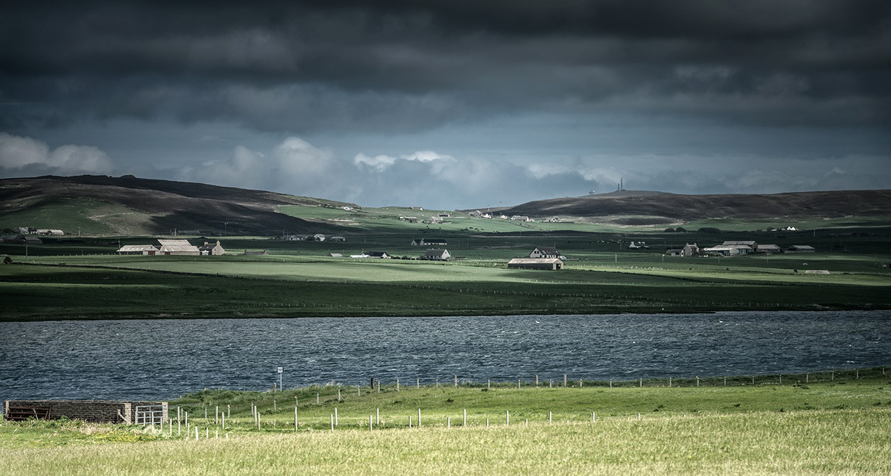
When Siri 🙂 and 🙂 Selma swing their brushes to paint pictures or the walls of their rooms, when they decide on the colour of their dresses in the morning, they deal with pigment or surface colours. In this world, the primary colours are C (Cyan a shade of blue), M (Magenta a full red) and Y (Yellow). However, when Dina and the other lens artists swing their cameras, they move into the world of light colours, which also applies to screens, neon signs and the rainbow f.e. Here the primary colours are R (a shade of Red), G (Green), B (a shade of Blue). These are the three colours that form the basis of all other colours through additive mixing.
Primärfarben
Ist es euch bewusst, dass es zwei Arten von Primärfarben gibt?
Wenn Siri 🙂 und 🙂 Selma ihre Pinsel schwingen um zu malen oder die Wände ihrer Zimmer anstreichen, wenn sie morgens sich für die Farbe ihrer Kleidchen entscheiden, dann handelt es sich um Pigment- bzw. Oberflächenfarben. In dieser Welt sind die Primärfarben C (ein Blauton), M (ein volles Rot) und Y (Gelb). Wenn jedoch Dina und die anderen Lens Artists ihre Kamera schwingen, bewegen sie sich in der Welt der Lichtfarben, die auch für Bildschirme, Leuchtreklame und den von uns geliebten Regenbogen gilt. Hier sind die Primärfarben R (ein Rotton), G (Grün), B (ein Blauton). Das sind die drei Farben, die die Grundlage aller anderer Farben durch additive Mischung bilden.

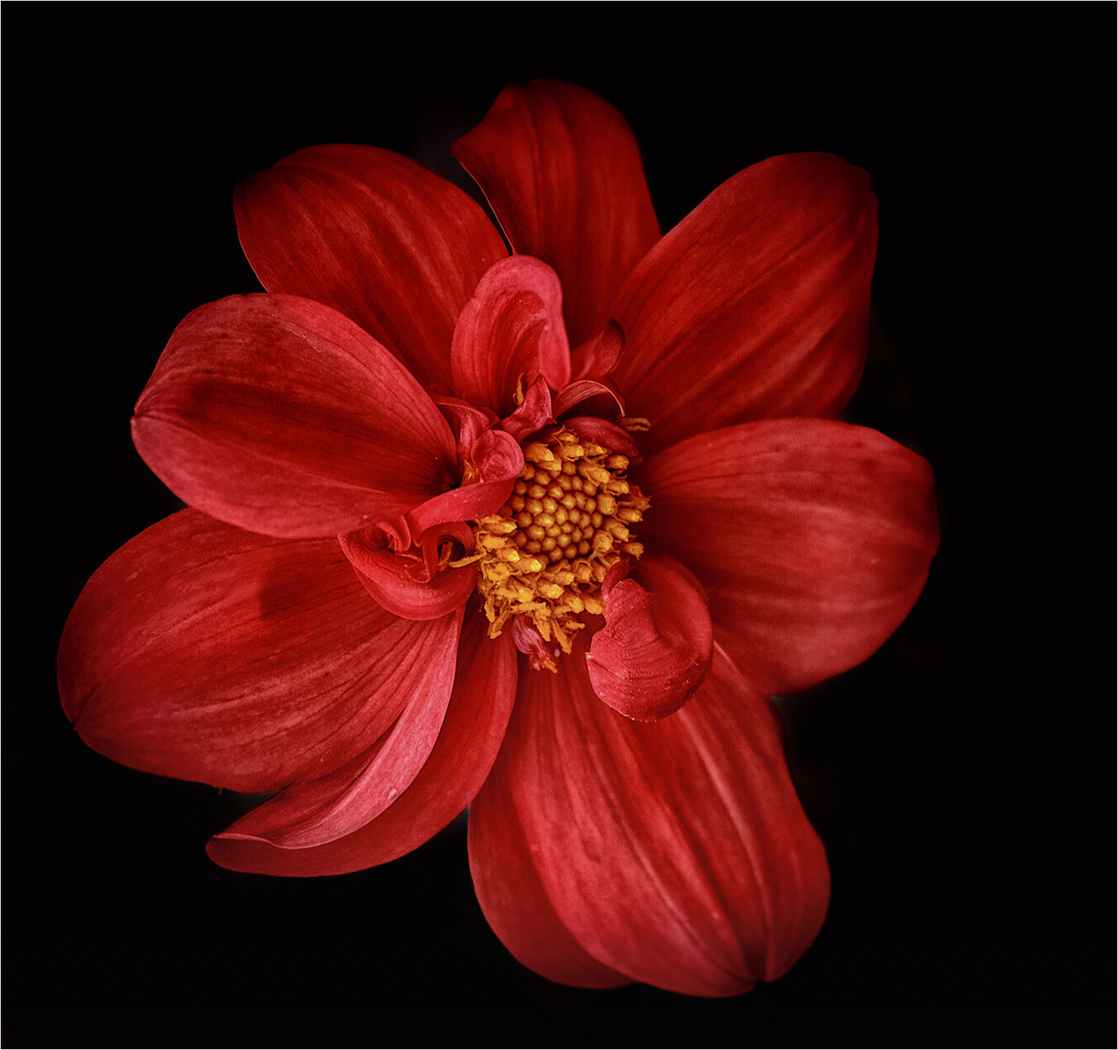
The wavelength of 650-700 nm is interpreted by our brain as red. With red we enter the world of colours. It is the colour that is first recognised as such, the colour that children reach for first. In terms of cultural history, our experience with colours also begins with red, namely with the red ochre with which the bones of the dead were painted in early times.
The polarity of colour meanings is clearly shown in view of red, which symbolises both love and war. The perception of red makes one aggressive and increases blood pressure, but it can also evoke romantic feelings and warmth. In any case, it stands out, which is why it says stop at traffic lights.
The witch craze was obsessed with the red colour because of the fear of the seductive feminine. Witches have red hair, wear red stockings – as they still do in most children’s book illustrations – , they wear a bright red headscarf and look piercingly out of red-rimmed eyes enchantingly at cattle and men.
On the art scene, Gilbert & George love red ‘because it is so beautifully superficial‘ as they said. Piet Mondrian, on the other hand, saw red as stylish.
Die Wellenlänge von 650-700 nm wird von unserem Gehirn als Rot interpretiert. Mit Rot betreten wir die Welt der Farben. Es ist die Farbe, die zuerst als solche erkannt wird, zu der Kinder als erstes greifen. Auch kulturgeschichtlich beginnt unsere Erfahrung mit Farben mit Rot und zwar mit dem roten Ocker, mit dem in der Frühzeit die Gebeine der Toten angemalt wurden.
Die Polarität der Farbbedeutungen zeigt sich deutlich angesichts Rot, das sowohl die Liebe als auch den Krieg symbolisiert. Die Wahrnehmung von Rot macht aggressiv und erhöht den Blutdruck, kann allerdings auch romantische Gefühle und Wärme hervorrufen. Auf jeden Fall fällt es auf, weswegen es bei der Ampel Stop sagt.
Der Hexenwahn war von der roten Farbe besessen, da es sich um die Angst vor dem verführerischen Weiblichen handelt. Hexen haben rote Haare, tragen rote Strümpfe – wie noch heute in den meisten Kinderbuch-Illustrationen – , sie tragen ein leuchtend rotes Kopftuch und schauen stechend aus rotumränderten Augen verzaubernd auf Vieh und Mann.
In der Kunstszene lieben Gilbert & George Rot, ‘da es so schön oberflächlich ist‘ wie sie sagten. Piet Mondrian dagegen sah Rot als stylisch an.
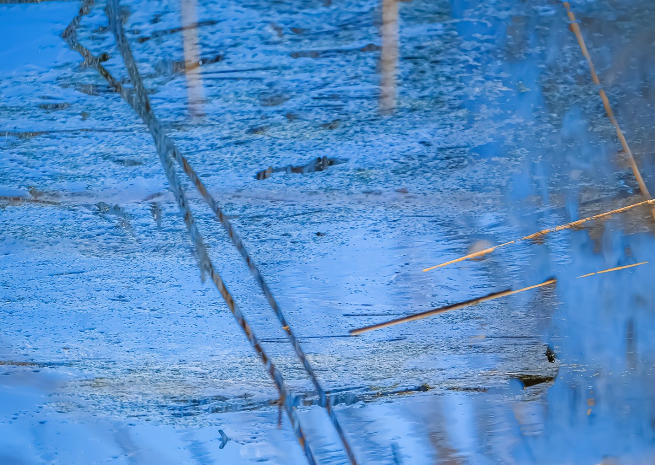
The wavelength of 500-550 nm is interpreted by our brain as green. Green is the colour of the middle, standing between cold and warm colours. The colour has a wide colour range.
Hugo St. Victor (12th century) considered green to be the most beautiful of all colours, as it symbolises spring, new beginnings and hope. In Islam, green is considered the colour of Muhammad, whose favourite colour it was. It is understandable that the oasis, as the green place, was loved by the desert peoples.
Green has a balancing, calming effect and stabilises blood pressure. Hildegard von Bingen saw ‘Viridias’, pure green, as the most healing colour.
On the other hand, green is associated with poison as the colour of mould and verdigris. In the early to mid 9th century, wallpapers coloured with an arsenical green were fashionable. Napoleon is said to have died from the fumes of this wallpaper in his house on St Helena.
Today, green symbolises natural and organic and a political direction dedicated to sustainability.

Die Wellenlänge von 500-550 nm wird von unserem Gehirn als Grün interpretiert. Grün ist die Farbe der Mitte, die zwischen kalten und warmen Farben steht. Die Farbe weist eine große Farbreichweite auf.
Hugo St. Victor (12. Jh.) sah Grün als die schönste aller Farben an, da es Frühling, Neubeginn und Hoffnung symbolisiert. Im Islam gilt Grün als Farbe Mohammeds, dessen Lieblingsfarbe es war. Es ist verständlich, dass die Oase als der grüne Ort, von den Wüstenvölkern geliebt wurde.
Grün wirkt ausgleichend, beruhigend und stabilisiert den Blutdruck. Hildegard von Bingen sah ‘Viridias’, das reine Grün als die heilmächtigste Farbe an.
Auf der anderen Seite ist Grün als Farbe des Schimmels und des Grünspans mit dem Gift verbunden. Zu Beginn bis Mitte des 19. Jh. waren Tapeten modisch, die mit einem arsenhaltigen Grün gefärbt waren. An den Ausdünstungen dieser Tapeten in seinem Haus auf St. Helena soll Napoleon gestorben sein.
Heute symbolisiert Grün natürlich und Bio und eine politische Richtung, die sich der Nachhaltigkeit verschrieben hat.
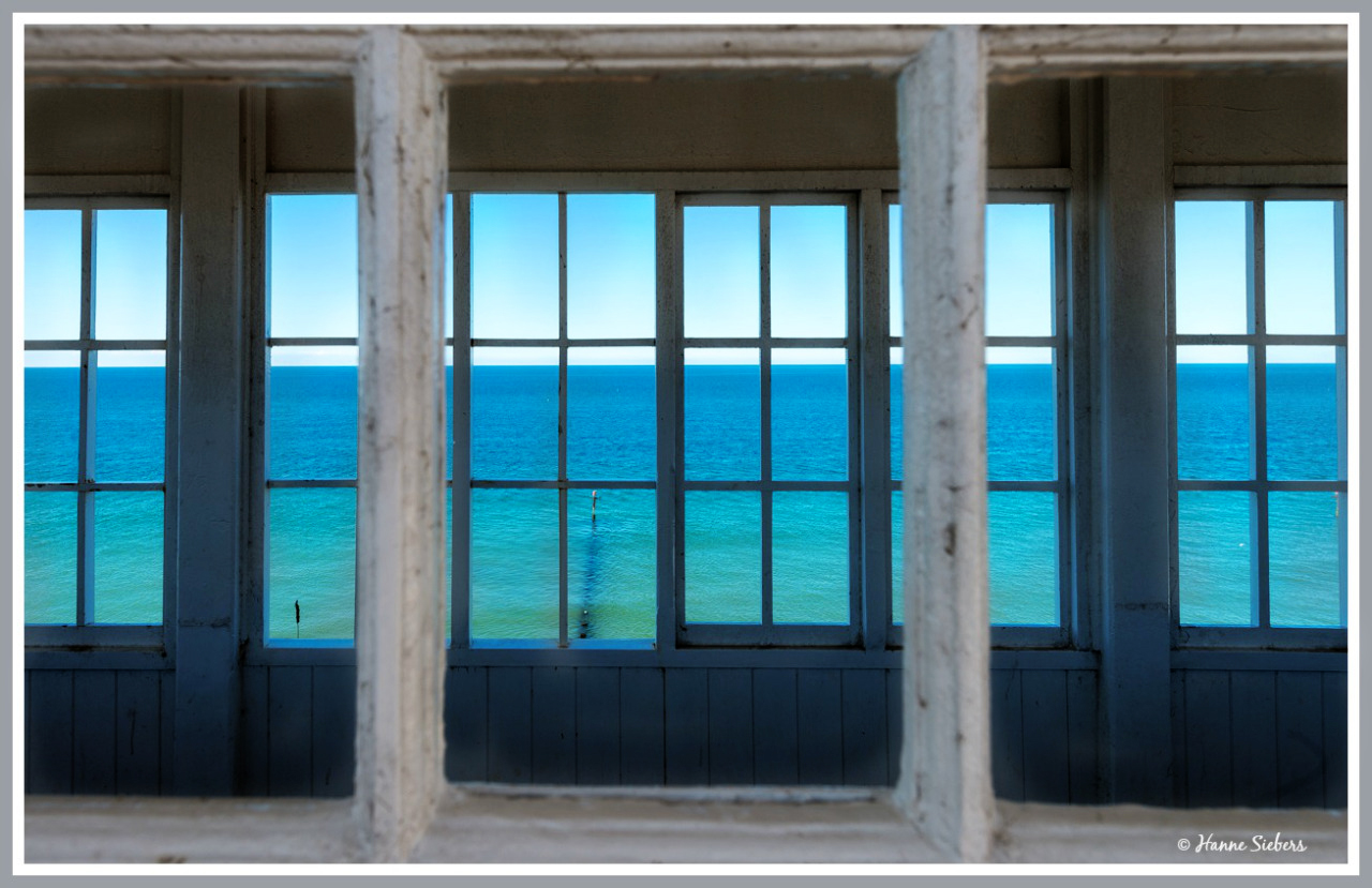
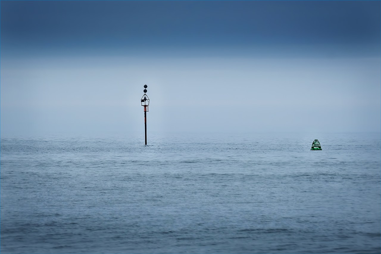
The wavelength of 450-500 nm is interpreted by our brain as blue. Blue draws you into the colour, you want to sink into it and at the same time you see everything in the distance slightly bluish, which made blue the colour of longing. As such, it also became the colour of the Romantics, which goes back to the key novel ‘Heinrich von Ofterdingen‘ by Novalis. It is from him that the expression ‘the blue flower of Romanticism‘ comes. Right at the beginning of the novel, the colour blue is mentioned so often that my editor would have immediately taken out her red pencil.
Even earlier, blue was associated with Gothic cathedrals. It was the magic of blue glass that was discovered at that time. For the glass artists of the Middle Ages, blue was the key colour. This can be seen specifically in the French cathedrals of Chartres, Amiens and Reimes. Windows without deep blue tones were considered boring and disorderly. Blue glass was also supposed to ward off evil, which is still believed in Armenia today.
Blue is also associated with Yves Klein and with the painters Jan van Eyck and Johannes Vermeer van Delft, whose blue tones were considered the most beautiful of all colours. Blue has been named as a favourite colour by most people in our cultural sphere from that time until today.
Blue is the coldest of all colours, it relieves fever and inflammation and blue light treatment lowers blood pressure. However, as a cold colour, it is also associated with depression and dejection, as evidenced by expressions such as ‘blues’ and ‘I feel blue’.
Die Wellenlänge von 450-500 nm wird von unserem Gehirn als Blau interpretiert. Blau zieht einen in die Farbe hinein, man möchte in ihr versinken und zugleich sieht man alles in der Ferne Liegende leicht bläulich, was Blau zur Farbe der Sehnsucht werden ließ. Als solche wurde sie zur Farbe der Romantiker, was auf den Schlüsselroman ‘Heinrich von Ofterdingen‘ von Novalis zurückgeht. Von ihm stammt der Ausdruck ‘die blaue Blume der Romantik‘. Schon zu Beginn des Romans wird die Farbe Blau, derart häufig angesprochen, dass meine Lektorin sogleich ihren Rotstift gezückt hätte.
Schon früher war Blau mit den gotischen Kathedralen verbunden. Es war die Magie des blauen Glases, die damals entdeckt wurde. Für die Glaskünstler des Mittelalters war Blau die Schlüsselfarbe. Das kann man speziell an den französischen Kathedralen von Chartres, Amiens und Reimes sehen. Fenster ohne tiefe Blautöne galten als langweilig und ungeordnet. Blaues Glas sollte ferner Böses abwenden, was noch heute in Armenien geglaubt wird.
Blau wird außerdem mit Yves Klein und mit den Malern Jan van Eyck und Johannes Vermeer van Delft verbunden, deren Blautöne als die schönsten aller Farben angesehen wurden. Es wurde seit dieser Zeit bis heute von den meisten Menschen unseres Kulturbereichs als Lieblingsfarbe genannt.
Blau ist die kälteste aller Farben, es lindert Fieber und Entzündungen und eine Blaulichtbehandlung senkt den Blutdruck. Als kalte Farbe wird sie allerdings auch mit Depressionen und Niedergeschlagenheit verbunden, wovon Ausdrücke wir ‘Blues’ und ‘I feel blue’ zeugen.
Thank you to Sofia for hosting this challenge. You can see her lovely work here.
Mit bunten Grüßen
The Fab Four of Cley
🙂 🙂 🙂 🙂
.
Here are some books by Klausbernd about colours
Einige Bücher von Klausbernd über Farben
Das große Buch der Farben (5th ed., Königsfurt-Urania, 2017)
Die Magie der Farben – erleben und anwenden (Königsfurt-Urania, 2010)
Farben (Droemer Knaur Publ., 2009)
Das kleine Buch der Farben (Königsfurt-Urania, 2008)
Die faszinierende Welt der Farben – ein Glossar von A-Z (ars momentum, 2008)
Sprache und Macht der Farben (ars momentum, 2007)
Das Geheimnis der Farbe Rot (Bauer Publ.)
Das Geheimnis der Farbe Schwarz (Fischer Media/Bern)
Das Geheimnis der Farbe Weiß (Fischer Media/Bern)
Das großoe Handbuch der Farben (Königsfurt Vlg.)
Farben (Gräfe & Unzer Publ.)
Schwarz-Weiß (Goldmann Vlg.)
.
© text and illustrations, Hanne Siebers & Klausbernd Vollmar, Cley next the Sea 2023

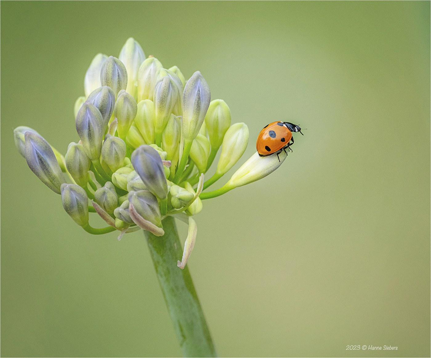
What a stunning selection of photos to illustrate the interesting text. The Ladybird is my favourite. 🙂
Love from Beetley, Pete and Ollie. X
LikeLiked by 5 people
Thank you very much, dear Pete 🙏🙏
What a beautiful weather we have.
Wishing you a happy week
The Fab Four of Cley
🙂 🙂 🙂 🙂
LikeLiked by 2 people
Fantastic images! I always enjoy coming here!
LikeLiked by 4 people
Thank you for your kind words.
We love to visit your blog regularly as well.
All the best
The Fab Four of Cley
🙂 🙂 🙂 🙂
LikeLike
This challenge is right up your street KB. But I understood that the primary colours in art/painting are RYB as these colours cannot be made from any other pigments. The RGB are colours of light and CMYK colours of printing. It gets quite confusing. What’s not confusing are Dina’s photos. The swimming pool is marvellous.
LikeLiked by 4 people
Hi, dear Jude
the difference is quite easy. All surfaces which are painted with pigment-colours are following the laws of CMYK. That means the primary colours are blue, red, yellow and the colour-producers use a black to get a real dark black. These colours mix in the subtractive way. It means with every mixture they loose light, they get darker. The light colours’ primary colours are RGB (orangered, green, blueviolet). These colours mix additive. With every mixture they get lighter.
Every picture you see here on your screen is following the laws of light colours. If you would print out these pictures they would follow the laws of pigment-colours. Therefore a print out never equals exactly the colours you see on the screen.
We here on this blog always deal with light colours.
Sorry, when I wasn’t clear in this post.
All the best
The Fab Four of Cley
🙂 🙂 🙂 🙂
LikeLiked by 4 people
Thanks for the explanation KB. I know you are an expert on colour theory!
LikeLiked by 2 people
What a very informative piece, Klaus. I did enjoy it. I’m a blue girl, but I was a bit of a red in my youth 🤣❤️ I was always told that red and green should never be seen, but that sweet ladybird on the agapanthas is beautiful.
LikeLiked by 4 people
Dear Jo,
in the middle ages the colour combination red and green was very much liked. Even in the 19th c. colour theorists like Goethe saw red and green and every combination of prime colours as ideal. That’s because they followed holistic ideas, f.e. with red and green (the subtractive mixture of blue and yellow) you have all the primary colours present like with combination of all primary colours with their complimentary colours.
The Impressionists used these combinations to strengthen the luminosity of the colours.
Most classic normative theories about colour combination saw a combination as better as further the colours are away from each other on the colour circle. Nowadays in modern design we prefer the opposite, colours which are quite near to each other’s shade. We have f.e. our sitting room painted in two different shades of grey and white bookshelves. We love it 🙂
Thanks and keep well
The Fab Four of Cley
🙂 🙂 🙂 🙂
LikeLiked by 2 people
Sounds beautiful!
And the Portuguese flag is red and green 😁❤️💚
LikeLiked by 2 people
It’s strange for us nowadays that red and green were often vertically separated from each other in the fashion of the middle ages, which was called mi parti. That’s like in the Portuguese flag.
LikeLiked by 1 person
How fascinating. I wonder if I can apply that to my ancient people. Why DID they begin painting their bodies and cave walls with colors (usually red ochre or black) 100,000 years ago?
Something interesting: My research into primitive people (I use that term denotatively) found the present day Piraha along the Amazon who have no words for colors. I don’t even know where to take that.
LikeLiked by 3 people
Dear Jacqui
It’s the theory that red as colour of blood and life animates the dead bones again as well as the animals in the pictures. This thinking follows the structure of analogical magic which we still have in the middle ages and ended with the age of enlightenment.
Thank you for letting me know that Piraha don’t have words for colours. They speak a language belonging to the Mura language family. There are no abstract words for colours as for numbers. I suppose they describe colours indirectly (in kind of metaphors ??). There was a similar discussion about Benjamin Lee Whorf’s hypothesises about language, thinking and reality. It was about Inuktitut and western languages. His ideas was that in Inuktitut are much more words for snow than in indogermanic languages. But it was argued against him, in our languages we describe the different forms of snow indirectly. I suppose it’s the case here as well that colour is described indirectly because colours give away basic information f.e. if berries, fruit or grasses can be harvested.
But as I wrote, I say this without knowing anything about the semantic structure of the Mura languages.
Thanks and keep well and happy writing
Klausbernd 🙂
LikeLiked by 1 person
P.S.
Sorry, another reason I forgot to mention why they used red ochre and black in those times is because it was available. The earth was easy to find and burned wood as well.
LikeLiked by 1 person
I wonder if early man focused on red because of blood or because it was available. I guess I’ll never know. You’re absolutely right about the Piraha, at least from what I’ve read. They label colors by nature around them–the red flower or blue sky–something like that. I find that a bit involved and maybe off target for my Neanderthals so I may leave the concept as more general even though it is so darn intriguing. I have integrated the Piraha approach to counting–which is no counting, merely noticing when a group seemed larger or smaller (much like we might notice a measure missing in a song because it doesn’t seem right).
We were amazing people 100,000 years ago!
LikeLiked by 1 person
Dear Jacqui
as abstraction evolved over thousands of years, their concept of colour was surely something we would call ‘crude’.
The problem is not not so much the seeing but the interpretation of the seen and what we call seeing.
Klausbernd 🙂
LikeLiked by 1 person
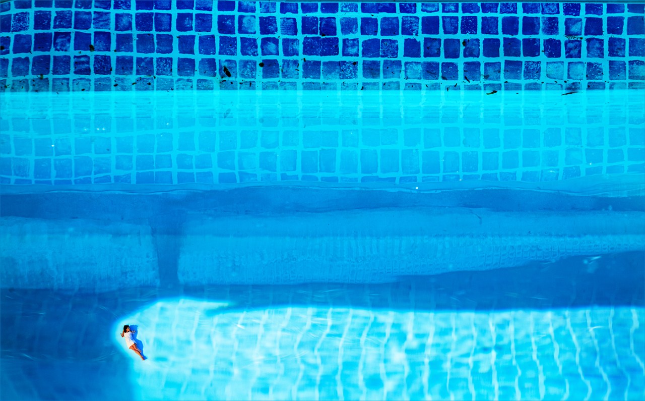
Well Klausbernd (and company) methinks you had an unfair advantage this week, having already written a book on color! That said, your post is, of course, wonderful. I am so glad you mentioned the PS/AI on the pool image. when I saw your header I couldn’t figure out how you were able to achieve that proportion. I’ve been playing with the beta PS as well and am finding it fun and interesting but I hope most, like you, are admitting when it’s been used. I loved your green image, which reminded me of a Christmas tree angel or a lovely little doll. A beautiful and informative post, well done!
LikeLiked by 3 people
Thank you very much, dear Tina.
Indeed, that was a topic I had to think about quite hard which info I would let out. I tried my best to keep it entertaining and providing only the very basic info about colours.
It’s in a way quite strange, blogging and photographing we all the time use light colours but most of the books about colour describe pigment-colours. “That’s old fashioned!” Siri 🙂 is outraged, because in our society we experience colour more and more as light colour.
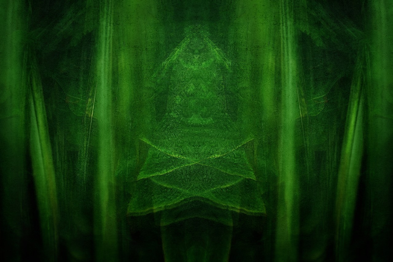
In this green picture that’s a fairy, Hildi Selma’s friend.
Especially Siri 🙂 and 🙂 Selma see AI\beta PS as a nice toy. They can play with for hours.
With love from the sunny coast of Norfolk
Klausbernd 🙂
LikeLiked by 1 person
Hi Tina, the header photo is a distorted red tulip. We made a post about achieving this effect during lockdown and many blogger tried it out. I remember HeyJude, Leya and Otto von Münchow posted their results shortly afterwards:
As for AI, I tried it out and very soon got bored. It’s not my kind of being creative. It frightens me a bit when I see what others create and how difficult it is to tell it’s a fake, but try to look it at it in a positive way. I would never post a photo without mentioning using AI.
Thank you for visiting. Absolutely loved your take on the challenge!
LikeLiked by 1 person
Me again, so sorry; Tina … Forget my comment. The first header we started with was the red twirl… 🙄
LikeLiked by 1 person
Informative and inspiring, I loved your post. I’ve also been playing with AI, first with Firefly and now with PS, and I’m glad you mentioned how your pool image was achieved, for me it doesn’t take way any of it’s beauty. I have to say my results have been less accomplished…
LikeLiked by 1 person
Dear Sofia
thank you very VERY much 🙏 🙏
We like playing around with AI. We don’t think that it takes away the beauty of the product. When since the times of Vermeer van Delft the painters used optical projections we use AI. It’s an art to use AI like it is an art to use a brush or the camera. Basically the picture counts in art and not tool that produced it.
We wish you a big progress using AI. Actually that would be an interesting topic in the lens artists challenge ‘How We Use AI’.
All the best
The Fab Four of Cley
🙂 🙂 🙂 🙂
LikeLiked by 1 person
Absolutely, well said. I see it more of a fun thing atm, still need to work on my prompts a bit. Thank you 🙂
LikeLiked by 1 person
I think it doesn’t matter how a picture was produced, the aesthetics of the picture is what counts.
LikeLiked by 1 person
It is so interesting to see, how different Lens artists go about the challenges. I love your photos, and it is hard to say which one is my favourite, but maybe the last one in the blue category. I would put that on my wall.
LikeLiked by 2 people
Hi, dear Stella
wow, that’s great that you would hang this blue picture on your wall. Dina feels honoured.
Wishing you a wonderful week
The Fab Four of Cley
🙂 🙂 🙂 🙂
LikeLiked by 1 person
I have a special relationship to water as a life giver, so the blue photos attracted me most.
LikeLiked by 1 person
On the blue planet the sea and the sky are blue. Blue is the colour we see more often than all the other colours.
LikeLiked by 1 person
Wonderful images. The red flower photo is especially exquisite and the ladybug 🐞 image is adorable. The text commentary is educational, making for a well-rounded post. An anecdote about color and color blindness. One day, my friend Ted asked his wife, Susan, why she never wears the brown outfit he gave her as a birthday present. Sue’s reply: Brown? That outfit isn’t brown, Ted, it is purple – bright purple.” They had been married around 15 years at that point and Sue had no idea that Ted had a form of color blindness. Anyway, wonderful post today. My best to all The Fab Four of Cley.
LikeLiked by 2 people
Good evening, dear Babsje
colour blindness is quite interesting. You find it much more in men than in women. To the age of 4 male and female are equally good in seeing colours but then it changes. Men specialise in seeing forms and women specialise in seeing colours. They can differentiate much more colours than men. The explanation is that in former times women were collecting plants for eating and colour told them if the berries or fruit etc. were ripe or not.
Another interesting fact is that seeing colours has to be learned. It’s not so much the seeing as the interpretation of the info of the cones send to the brain. But colour blindness in men can often be traced back to a cone deficiency.
All the very best to you
The Fab Four of Cley
🙂 🙂 🙂 🙂
LikeLiked by 2 people
Your reply is fascinating! I learned so much reading it. Thank you for the details. Discerning between Orange and Red has shown a lot of “individual differences” in my experience. There are some Reds that I perceive as Orange, whereas a friend sees them as true Reds. (But if course my own eyesight is not so acute these days.) And kudos again to Dina for her splendid photographs. And oh, what it would be like if humans had the capacity to see the UV ranges visible to many birds! Thank you. All my best to The Fab Four of Cley and your color palettes. 🎨 🎨 🎨 🎨
LikeLiked by 1 person
Dear Babsje
as more you know about colours as more different shades you can see. How many nuances you can perceive has to do with if you are used working with colours, if you are male or female and what mood you are in f.e.
Thank you very much for your exchange
Klausbernd 🙂
LikeLiked by 2 people
Meine Lieblingsfarbe bleibt Blau, erst recht nach Deinen Fotos. Dann das Grün. Blaugrün ist die beste Mischung, die es gibt für mich, was sich auch in meinen Lieblingskleidungstücken spiegelt. Und jetzt werde ich mich noch einmal in Deinen Text vertiefen, denn es stecken so viele liebenswerte Informationen darin, die ich nicht vergessen möchte. Liebe Grüße an Euch alle und kleine, himmelblaue Umarmungen für Siri 💙🙂 und 💙🙂 Selma!
LikeLiked by 2 people
Hallihallo
mir stehen auch Türkistöne sehr gut, ich liebe dieses Blaugrün. Petrol gehört auch in diese Farbgruppe, das mich auch fein kleidet.
Siri 🙂 und 🙂 Selma senden dir besten Feenhauch ✨💫🌟💫✨ und ganz liebe Grüße von
Klausbernd 🙂
Dina läßt auch herzlich grüßen
LikeLiked by 1 person
Danke, lieber Klausbernd, fuer diese hochinteressanten Ausfuehrungen und danke, liebe Dina, fuer die fantastischen erlaeuternden Bilder.
Liebe Gruesse aus dem immer noch heissen Texas,
Pit
P.S.: Die Klimaanlage im Wohntrakt ist ausgefallen, aber gleich kommt ein Monteur vorbei.
LikeLiked by 2 people
Danke, lieber Pit, da können wir nur sagen keep cool und dir die Daumen halten, dass der Monteur euch vom Schwitzen erlöst.
Naja, Farben ist für mich so etwas wie ein Heimspiel. Nachdem ich so viel zu diesem Thema gemacht habe, inklusive drei Fernseh-Filme dazu, war das eine leichte Übung, die mir allerdings Spaß gemacht hat. Ich hatte erst vorgehabt, Dönekes aus der Welt der Farben zu erzählen, so dass z.B. Henry Ford sagte, er liebe alle Autofarben, wenn sie nur schwarz seien, oder Caravaggio, der fast nur dunkle Bilder malte, aber Blau als Farbe ablehnte, weil er es zu dunkel fand und das Beste fand ich, dass Mondrian seine Schreibmaschine rot anmalte, da sie sonst nicht in sein Atelier passte. Naja, aber letztendlich blieb ich dann doch mehr dem Erwartungshorizont unserer Leser verpflichtet. Huch, erschreckend, wie angepasst ich mit zunehmenden Alter werde. Kennst du das auch?
Mit ganz lieben Grüßen ins heiße Texas und gute Besserung für Mary
Klausbernd 🙂
LikeLike
Excellent and informative prose, Klausbernd,
Accompanied by some great images
LikeLiked by 2 people
Thank you very, dear Sue. It’s great that I get some praise for my texts as well.
I wish you a wonderful happy week
Klausbernd 🙂
LikeLiked by 1 person
Hope you all have a great week too!
LikeLiked by 1 person
Beautiful examples of the colors. Thanks, F4oC
LikeLiked by 2 people
You are very welcome, dear John.
Wishing you a wonderful week
The Fab Four of Cley
🙂 🙂 🙂 🙂
LikeLiked by 1 person
You as well. 😁
LikeLiked by 1 person
Fab Four of Cley,
What an amazing post! I knew Dina studied photography, but these images are remarkable!
And thank you for the color lessons.
GP
LikeLiked by 2 people
Dear GP
thank you very much for liking our post.
Well, colour is our topic.
We wish you an easy week, our dear friend
The Fab Four of Cley
🙂 🙂 🙂 🙂
LikeLiked by 1 person
What a wonderful, colourful, insightful and exciting post! I did not know the difference between light colours and primary colours. Dina’s outstanding photography added so much understanding to this discussion. I now understand the differences between the light colours and primary colours can greatly impact the overall aesthetic and emotional impact of a design or artwork. I look forward to every one of your posts. Sending many thanks along with hugs to my dear friends, The Fab Four of Cley.
LikeLiked by 2 people
Dear Rebecca,
when we speak about primary colours it depends on in which system they are primary. Here on our blogs and in all the digital communication we write and read on screens we deal with light colours. There the primary colours are RGB what’s red, green, blue. But when you are painting a picture or your walls you deal with pigment = surface colours. There the primary colours are CMY, blue, red and yellow. In the light colour system you mix red and green to get yellow that means yellow is not a primary colour in this system. In the system of surface colours you mix blue and yellow to get green that means green is not a primary colour in this system. Another difference is that light colours mix in an additive way that means with mixing the colours get lighter whereas surface colours mix subtractively that means with mixing these colours get darker. You can mix more subtle shades of colours with light colours than with surface colours. If you mix more than three times the surface colours you end up with so called miscolours, some shades between brown and grey.
Wishing you a happy week and sending big hugs to Vancouver
The Fab Four of Cley
🙂 🙂 🙂 🙂
LikeLiked by 2 people
Thank you for this additional information, Klausbernd. I recall that when I was in my high school art class, my teacher asked us to mx CMY. I was fascinated by how I could mix blue and yellow to get green and so on down the line. And I remember ending up with miscolours. I now have Goethe’s “Theory of Colour”. Would love to read it in German, but alas that is not to be. I love his first lines, which, to my thinking, confirm curiosity is essential for acquisition of knowledge.
“The desire of knowledge is first stimulated in us when remarkable phenomena attract our attention. In order that this attention be continued, it is necessary that we should feel some interest in exercising it, and thus by degrees we become better acquainted with the object of our curiosity.”
LikeLiked by 3 people
You are very welcome, dear Rebecca. I grew up in my teens surrounded by Steiner people. Rudolf Steiner was the editor of Goethes Theory of Colour. He edited it with excellent interpretations as footnotes. The artists of the Bauhaus were influenced by Goethe/Steiner especially Kandinsky.
LikeLiked by 1 person
Dear Rebecca
as you are interested in Goethe whose birthday we celebrate today: At the end of his life Goethe said that from all works he had written his ‘Theory of Colour’ was the most important – for him and the world.
Turner was one of the first ‘fans’ of Goethes colour theory.
Love
Klausbernd 🙂
LikeLiked by 1 person
Serendipity came calling again, Klausbernd. I was exploring Joseph Mallord William Turner painting of Staffa, Fingal’s Cave, yesterday.
Thank you for the recommendation of Theory of Colour – found it on Amazon and now have a copy.!!! Isn’t is exciting to learn something new.
LikeLiked by 2 people
The third chapter (I think it is the third) ‘Über die sinn-sittliche Wirkung der Farbe’ (On the Sensual-Moral Effect of Colour) was the first study of what we would call today ‘Psychology of Colour’.
LikeLiked by 1 person
A very good explanation of the differences between colors for print and colors for screen. But above all I enjoyed the beautiful images you added, really TOP!
LikeLiked by 2 people
Thank you very much 🙏 🙏
send in light colours 😉
The Fab Four of Cley
🙂 🙂 🙂 🙂
LikeLike
In the world of commercial printing, It’s CMYK.
LikeLiked by 2 people
Hi Ray,
as we wrote as in system of surface colours the primary colours are CMY, that means with these three colours cyan, magenta and yellow you can produce all other colours. In printing the problem is printing a clear black. In theory all surface colours add up to black but in reality the pigments don’t represent 100% clear colours and therefore you always get a blue, green, or even a red shine when you print black in adding subtractively all the colours. To avoid this problem you use as fourth colour K which stands for black. Every printer uses CMYK for colour printing.
All the best
The Fab Four of Cley
🙂 🙂 🙂 🙂
LikeLiked by 1 person
You do understand that I spent six years in Hong Kong printer every sort of book. Please never preach theory to me. Ever.
LikeLike
Hi Ray,
we wrote about the light colours in our post and not so much about CMYK.
I learned printing on the old Heidelberg printing machines for offset but those days are gone. We feed the printing machine with our data and can manipulate the colours digitally. Without colour theory there wouldn’t exist a printing machine or any colour screen.
Thanks
Klausbernd 🙂
LikeLike
Beautiful photos and thank you for the information about the colors and how we see them. Like Dina I am also a big fan of Hockney.
LikeLiked by 2 people
Good morning, dear Anne
We all are big fans of David Hockney. We blogged about him recently as you know
Hockney is a painter who likes primary colours. Primary colours give a picture a certain charm that we like in chidren’s pictures as well.
Thanks for commenting.
Wishing you an easy week
The Fab Four of Cley
🙂 🙂 🙂 🙂
LikeLiked by 1 person
Such beauty!
LikeLiked by 2 people
Hi Cynthia
thanks a lot 🙏 🙏
All the best
The Fab Four of Cley
🙂 🙂 🙂 🙂
LikeLike
Lovely colours.
LikeLiked by 2 people
Thanks, dear Anneli!
Wishing you a wonderful week
The Fab Four of Cley
🙂 🙂 🙂 🙂
LikeLiked by 1 person
That is a very interessting read about the colours. The photos are amazing as always. My favourite is the lady bird on the agapanthus. My favourite colour is blue, always has been for some reason. I love blue dresses. 🙂
Fantastic post froum the Fab four! Thank you.
LikeLiked by 2 people
Dear Ute
thank you very much for your kind words.
It took Dina many MANY shots to get this lady in this position. It takes patient to lure a lady bird moving to a special spot …
Wishing you an easy week
The Fab Four of Cley
🙂 🙂 🙂 🙂
LikeLiked by 1 person
Dear friends, what a tailor-made topic for you all!
Interesting, insightful and as always with stunning photos. Love the swimming-pool, Dina! Hockney’s early paintings of Nick getting out of the swimming-pool will always stay with me and I understand your motivation for adding a person to the water.
I’m just back from visiting a good friend, Lisbeth in Helsingfors, whom you also know. The guest room is decorated with sketches by her grandchildren. The older ones are all with no exception in striking primary colours. As the children grow older it is interesting to see how the colours are slightly changing, becomes more muted.
Good luck with your next colour book and cards project!
Kram
Annalena x
LikeLiked by 3 people
Dear Annalena
it’s unbelievable that we didn’t choose this topic, but we didn’t. We had blogged about colours already. At the same time now Klausbernd is asked to write the text for a multimedia colour project. Anyway, it was the right topic to to the right time.
We suppose, part of the charm of Hockney’s pictures is his love for primary colours. The tendency that one loves colours more muted as older one gets does not apply to Hockney.
This colour book, card and app project … oh dear, I can’t decide if I should do it. The challenge is the cards, which system to use. On one hand I see this project as a chance to express everything I know about colour and working together with a young team. On the other hand I think I am retired and I like lazy afternoons reading, working in the garden, why doing a job you sit most of the time inside and you have to do it – whereas I like the routine of writing 3 hours in the morning and doing nothing, reading or some outside jobs in the afternoon. Well, I don’t know. I’ll phone you, we’ll talk about it.
With lots of love to Stockholm from all of us
The Fab Four of Cley
🙂 🙂 🙂 🙂
LikeLike
Ihr Lieben, besser geht’s nicht.
5 Sterne von uns für Text und Bilder.
LG U+H
LikeLiked by 3 people
Liebe Uschi, lieber Herbert
gaaaanz herzlichen Dank für euer Lob, worüber wir uns SEHR freuen.
Mit herzlichen Grüßen nach Frankfurt
The Fab Four of Cley
🙂 🙂 🙂 🙂
LikeLike
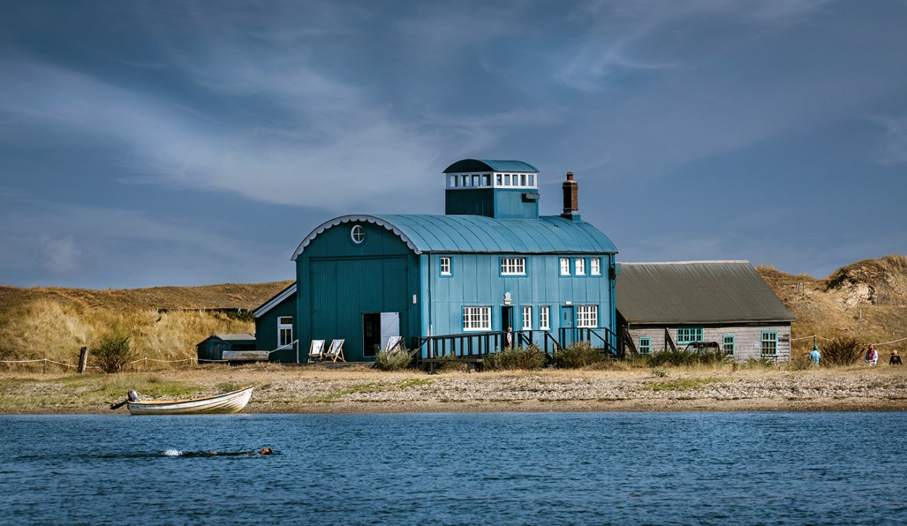
Great post! How lovely to see the familiar Lifeboat House and surroundings on Blakeney Point in this concept.
We have had a good mix of weather today and now I can see a rainbow appearing. I wonder what a colourblind person makes of a rainbow? How many colours would a colour blind see?
I’m very much looking forward to catching up with you in North Norfolk soon.
Klem
Per Magnus
LikeLiked by 2 people
Dearest Per Magnus
in a way you asked the question if blind people can see colours. You know, my sister Doris is nearly blind but a specialist for modern art working in one of the leading museums for modern art (Museum Ludwig, Köln) worldwide. She told me that seeing and seeing colours is something you do with your mind. That’s understandable as the info from receptors in the eye are send to brain where it’s decoded as a specific colour.
I was often asked on my lecture tours and more so in talk shows if blind people dream in colours. Colour vision seems to be inborn in us. Blind people seem to dream in colour. This raises the problem of what it means to dream ‘in colour’? The perception of colour is highly subjective.
It is easier with surface colours. Once I read about a painter who claimed that she could feel colours by holding her hands above them.
With light colours like the rainbow, I’m not quite sure about it. It seems to be that our body has cells that can read in the different wavelength of the colours. The anthroposophic colour healing is based on this as they try to heal with of silk in different colours.
I suppose, blind people can’t see the colours of the rainbow, at least not in the way we experience colour.
How many colours is another question. That we see 7 colours in the rainbow goes back to Newton and his alchemist ideas. 7 is the number of perfection. Therefore the perfect white light is sum of 7 basic qualities. Since Newton we are used to see 7 colours in every prismatic fraction of light. You could see more or less colours in the rainbow, it depends how much you want to differentiate.
Now the sun is shining. In the morning is was rather grey and cold but now it is nice nevertheless an autumn feeling. How is it at yours?
With lots of love to Longyearbyen/Spitzbergen, mind the polar bears
GREAT seeing you soon
Klausbernd 🙂
LikeLike
P.S.
Concerning rainbow – When Faust saw in the beginning of Goethe’s ‘Faust II’ the rainbow he said “am farbigen Abglanz haben wir das Leben”. Well, very freely translated this means colour makes our life.
LikeLike
Oh, sorry I just noticed that your question is about colourblind people.
A colourblind person reacts, let’s say, to red like a person with normal sight. Red is associated with the top of traffic lights and with other people’s reaction to this colour you only see a shade of grey. You learn with model learning to react to this special shade of grey. Like in a B&W film, after a while you imagine colour.
I would think that a colour blind person sees at the position of red and green a shade of grey. Colour blindness more or less only effect red and green, a blindness for the other colours is extremely rare.
Klem
Kb 🙂
LikeLike
There’s always the slippery question of where to draw the line between nearby colors. People often use “blue” to describe what I see as more “purple” or “violet.” Where English has the single word “blue,” Russian requires a speaker to choose between the darker синий (siniy) and the lighter голубой (goluboy).
LikeLiked by 2 people
Dear Steve
you are absolutely right. Our everyday language isn’t able to provide words describing colours exactly. We have to go into another system when communicating about colour exactly. The German colour theorist Harald Küppers edited a colour atlas with 5500 colour nuances. He used the CMYK system. F.e. I like a greenishblue C40, Y30, S70. This is exact but not useful in every life conversation. You would not say the sea is today so lovely C99, Y10, M00.
Thanks & cheers
The Fab Four of Cley
🙂 🙂 🙂 🙂
LikeLike
Nice discussion and examples of the “color” of light vs. pigment. Interestingly, when all the “colors” of light converge you get white, but converging pigments will yield black, or very close to it. Thanks again.
LikeLiked by 2 people
Dear Brad
with light colours you add light and therefore you get a lighter colour every time you mix them and the all add up to white. “White” is misleading, it has nothing to do with the pigment-colour white but it is the translucent Light, like daylight.
Thanks and all the best
The Fab Four of Cley
🙂 🙂 🙂 🙂
LikeLiked by 2 people
Or the absence of colour.
LikeLiked by 2 people
Very good pictures and informative text. In my professional life I always had to do with colours, oft from many points of view, chemical, application of colours, tastes creativity. I also worked as colorist, my job was to imitate a specific colour! Perhaps this is why I like B&W photography, a kind of reaction! But in my drawing and painting I prefer the emotion of colours!
LikeLiked by 3 people
Dear Robert
B&W makes a lot of pictures look more arty. B&W is honest, it presents itself as an artefact. The picture is more important than the object it shows. Good B&W pictures are for us minimalistic abstractions.
Thanks for commenting
The Fab Four of Cley
🙂 🙂 🙂 🙂
LikeLiked by 1 person
Hi Fab Four, a lovely deep dive into red, green and blue. Of these three, I would chose green as I see it as the colour of nature which I love. My favourite colours are yellow, orange and pink.
LikeLiked by 3 people
Dear Roberta
I like yellow as well. Writing this, I am wearing a yellow fleecejacket.
Green has so many shades (much more than yellow) that it depends on the shade if I like it or not. I like to wear a cold green T-shirt over a middle green shirt. With pink I have a problem, maybe because I am a man.
Thanks for commenting
The Fab Four of Cley
🙂 🙂 🙂 🙂
LikeLiked by 1 person
Green does have many more shades. I see that with my drawing pencils 🥰
LikeLiked by 1 person
Green and blue have most shades of all colours except white.
LikeLiked by 1 person
Yes, I made deep red fondant roses today by mixing dark purple into bright red.
LikeLiked by 2 people
You digged a bit deeper into color theory than I did. Well done!
LikeLiked by 1 person
Thank you very much, dear Solaner.
I studied colour and colour theory for many years, starting with the symbolism and ending up at optics.
Thanks and all the best
The Fab Four of Cley
🙂 🙂 🙂 🙂
LikeLiked by 1 person
Well done 👍
LikeLiked by 1 person
Klausbernd, your post was educational and beautiful. Thank you!
LikeLiked by 1 person
Dear Anne
We like your post very much 👍 Looking at your pictures put a big smile on our faces.
See you
The Fab Four of Cley
🙂 🙂 🙂 🙂
LikeLike
Thank you. I’m so glad I could help put a smile on your faces.
LikeLiked by 1 person
🙂 🙂 🙂 🙂
LikeLiked by 2 people
Beautiful and entertaining – and educational of course. I always learn from you – all of you, Fab Four! I must admit I shy away from AI, I don’t want to “lose my soul…” But, of course I will try it too, even if I run the risk of getting hooked there. Good that you told us about the lady being AI. Of the colours I love most of all the green section. Not only because green is a favourite colour of mine.
LikeLiked by 1 person
Dear Ann-Christine
green is nowadays so much associated with nature and living sustainably that one has to liked it.
We use AI for cooking, looking in our fridge and let AI present us a recipe with these ingredients. We give in ‘easy cooking’ as well.
I just write a book and use it for researches. It finds info much faster than I do. Siri 🙂 und 🙂 Selma use pictures of them or us. Then they change the colours of our eyes and hair, our body shape or what so ever. It’s playing for them and Dina uses it many levels higher when editing her pictures. In our Volvo it makes driving more relaxed. I am sure AI is the future. We have to learn to use it.
Thank you very much
The Fab Four of Cley
🙂 🙂 🙂 🙂
LikeLiked by 1 person
I know, but it is at the same time frightening when you read about what it can do..
LikeLiked by 1 person
Dear Ann-Christine
every new technology is frightening in the beginning. We have to learn to use it. I don’t know why I am not frightened, but I am not.
Wishing you a happy weekend
The Fab Four of Cley
🙂 🙂 🙂 🙂
LikeLike
What scares me, is that we might no longer be able to see what is fake or not. It was difficult before, now even more. This could be used to dangerous ends.
LikeLiked by 1 person
Fake news started on a big scale with the Christian church, with the invention of the devil, of paradise and hell, virgin birth etc. In comparison AI is quite limited.
Nevertheless I agree, it gets difficult to decide what’s real and what’s fake.
Wishing you a wonderful week
The Fab Four of Cley
🙂 🙂 🙂 🙂
LikeLiked by 1 person
Thank you, you too! ♥♥♥♥
LikeLiked by 1 person
Incredible selections of these colors, Wow!! These are art works, Fab Four! I admire your knowledge and photography skills.
LikeLiked by 1 person
Dear Amy
thank you very much for your kind words 🙏 🙏
Around the age of 19, an Anthrosophic (Steiner) teacher introduced me to Goethe’s Theory of Colour. Since then always came back to colours in symbolism, in art and in fashion and product design.
Dina is very dedicated to her photography and gets a lot of praise for it.
Your post about the primary colour is well done 👍
Thanks again for your kind words
The Fab Four of Cley
🙂 🙂 🙂 🙂
LikeLiked by 2 people
I admire Dina’s photography skills!
Thank you for the link. 🙂
LikeLiked by 2 people
She is very ambitious with her photography.
Thank you
The Fab Four of Cley
🙂 🙂 🙂 🙂
LikeLiked by 1 person
A wonderfully creative post 🙂 While blue is my favorite color (and the swimming pool shot with the AI touch is brilliant) – the bliss of the greens you captured and described left me feeling very peaceful. The photo of the multiple exposures of green leaves in the garden is a perfect representation. Wish you all a wonderful day.
LikeLiked by 2 people
Good evening, dear Randall
Green makes indeed peaceful. It’s the bottom of the colour circle between warm and cold cold colours, the colours have come to a rest. Early personal computers had this horrible shade of green as writing background. It was meant to relax – but not that ugly green.
Siri 🙂 once said ‘Blue is too much emotion, green is better between the extrovert yellow and the introvert blue.’
Wishing you a wonderful end of the week
The Fab Four of Cley
🙂 🙂 🙂 🙂
LikeLiked by 1 person
Fabulous post! ❤️
LikeLiked by 2 people
Thank you VERY much!
We love this topic and we love colours, of course.
Keep well
The Fab Four of Cley
🙂 🙂 🙂 🙂
LikeLiked by 1 person
That’s a beautiful set. And your choice of the lead photo in each colour is utterly charming. The Hockney blue, and the portrait in a red dress are keepers
LikeLiked by 1 person
Thank you so much!
We are happy that you like Dina’s photography.
We wish you a happy weekend
The Fab Four of Cley
🙂 🙂 :-):-)
LikeLiked by 1 person
Strinking colors and the sharpness of the photos is great, love the blue shots. Then again all of them are quality shots.
LikeLiked by 1 person
Dear Ritva
thanks a lot for liking Dina’s photography.
We are specialists for colours, their impact, physics and symbolism.
Happy weekend
The Fab Four of Cley
🙂 🙂 🙂 🙂
LikeLiked by 1 person